

Selecting the perfect paint color can be more complex than it seems. One significant factor often overlooked is Light Reflectance Value, or LRV. This metric measures the percentage of light a color reflects; the higher the LRV, the lighter the color. Understanding LRV can be crucial in determining how paint will behave under different lighting conditions in your space. For instance, a room with minimal natural light benefits from paints with higher LRV to make it feel airier, while a sun-drenched room could comfortably handle lower LRV shades to prevent overwhelming brightness. By grasping how LRV interacts with both artificial and natural light, you can make more informed choices to enhance the ambiance and aesthetic of any space. Recognizing its influence helps ensure that your selected shades complement their surroundings effectively.
How LRV Affects Paint Choice
Understanding how Light Reflectance Value (LRV) influences paint choice can transform the aesthetic and functional outcome of a painting job. LRV measures the percentage of light a paint color reflects and absorbs. This seemingly technical detail has practical implications that any business owner considering a painting project should explore.
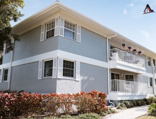
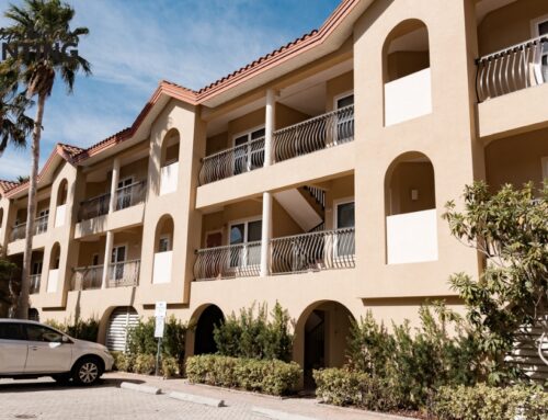
High LRV colors reflect more light and can make a space appear larger and brighter. These hues are ideal for spaces with limited natural light, such as north-facing rooms or basements. They contribute to energy efficiency by maximizing the use of available sunlight, possibly reducing the need for artificial lighting during daylight hours. Consider off-whites, soft pastels, or any lighter shades for office settings or retail environments aiming for an open, airy feel.
Conversely, low LRV paints absorb more light, creating a cozy, intimate atmosphere. Deep blues, rich reds, and charcoal grays are typical examples that suit spaces like restaurants, conference rooms, or hospitality settings, where ambience is key. These colors can also help minimize glare from computer screens or bright lighting, providing a comfortable work environment.
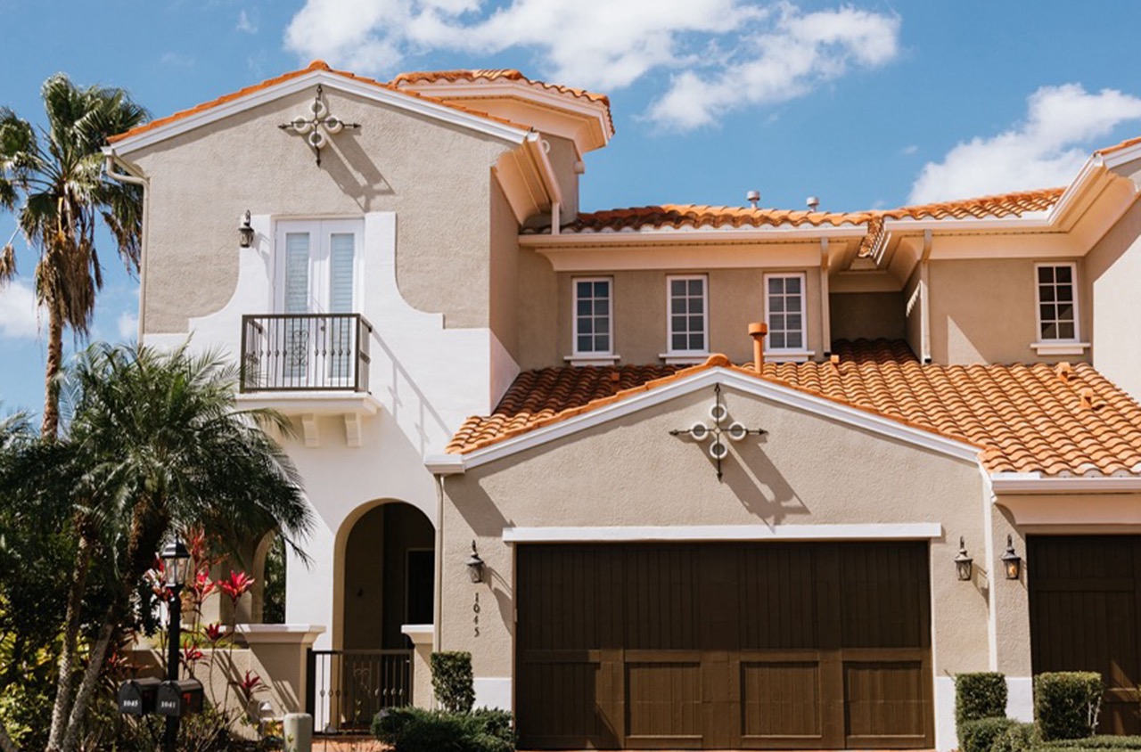
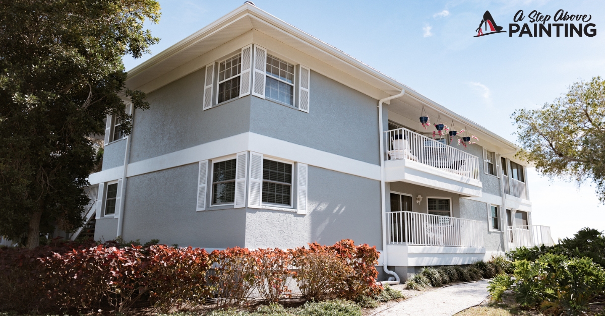
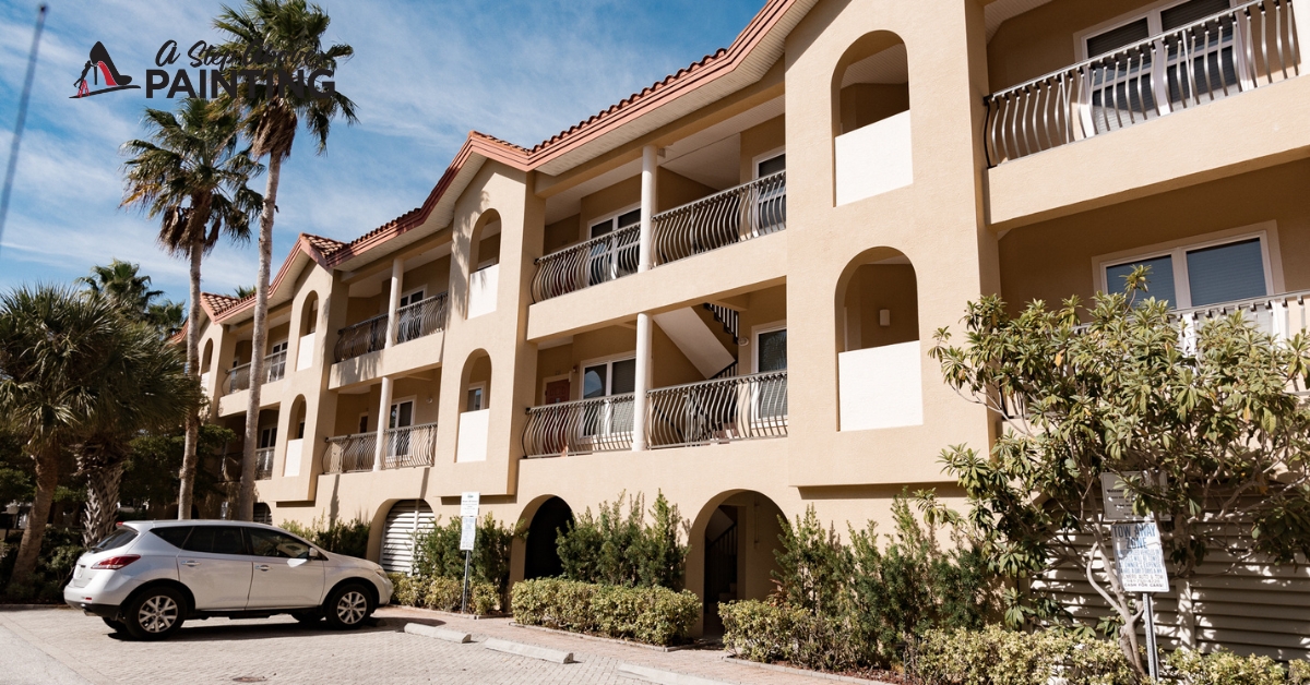
When selecting paint for exterior surfaces, LRV is equally crucial. Paints with higher LRV help reduce heat absorption, which is particularly beneficial in sunny areas like Florida. Choosing lighter colors can keep building surfaces cooler, potentially decreasing cooling costs. However, balance aesthetics and practicality; consider surroundings and the desired visual impact when picking a color scheme.
Paint finish also interacts with LRV. Glossy finishes enhance light reflectance more than matte finishes, impacting the perceived brightness. It’s important to test paint samples on walls and observe how light interacts with them throughout the day to achieve the desired effect.
By grasping the concept of LRV, business owners can make informed decisions that not only enhance their space’s visual appeal but also improve energy efficiency and user comfort. It’s a valuable aspect of paint selection that goes beyond color, adding strategic depth to design choices.
Influence on Room Temperature
Color is a crucial factor that can influence room temperature, subtly affecting energy efficiency and comfort. Understanding this helps make informed decisions in both residential and commercial spaces.
Light colors like whites, creams, and pastels can reflect more light and heat, maintaining a cooler environment. In hot climates like Sarasota and Manatee Counties, using light colors on walls, ceilings, and even roofs can reduce reliance on air conditioning, saving energy and reducing electricity bills. This reflective property makes these colors ideal for areas that receive a great deal of sunlight. Conversely, dark colors absorb more heat. While they can create a cozy atmosphere in cooler months, they may raise temperatures during warmer periods, increasing cooling costs.
The finish of the paint also contributes to how color affects temperature. Glossy finishes reflect more light, enhancing the cooling effect of lighter shades, whereas matte finishes might trap slightly more heat. In commercial settings, where energy efficiency can significantly impact operational costs, selecting the appropriate color and finish can lead to considerable savings.
Apart from practical aspects, psychological responses to color impact perceived temperature. Cool shades like blues and greens can make a room feel cooler than warm shades like reds and oranges. This perceived change can be leveraged to create comfortable workspaces that feel refreshing. A room painted in cool tones may feel several degrees cooler than it actually is, allowing for a relaxed environment conducive to productivity.
Opting for a color scheme that complements energy goals is both economically smart and environmentally responsible. Consulting with professional painters who understand the nuances of color effects ensures spaces not only look appealing but function efficiently. By strategically selecting colors based on their thermal properties, businesses and homeowners alike can create environments that balance style with practicality.
Saving Energy with the Right Color Selection
Choosing the right colors for a painting project can contribute towards an energy-efficient space, which can significantly reduce electricity costs. Reflective paint colors are particularly useful for optimizing natural light, thus minimizing the need for artificial lighting throughout the day.
In warmer climates like Sarasota and Manatee Counties, lighter shades can be used inside and out to deflect sunlight and reduce heat absorption. This can help keep a building cooler naturally, decreasing the demand on air conditioning systems. For example, white or very light-colored exteriors reflect the sun’s rays rather than absorb them, keeping interior temperatures more stable.
Inside, reflective lighter shades such as off-white, cream, or pale gray can bounce more light around a room. This increases the brightness using less electrical lighting, which could cut down your energy bills over time. Positioning mirrors strategically can amplify this effect, redirecting both natural and artificial light around the space and creating an airy feel even in smaller rooms.
In contrast, darker colors can be used deliberately in certain rooms or features to absorb heat in the cooler months, if your building does not receive direct sunlight for long periods. Balancing light and dark colors effectively helps regulate temperature and energy consumption throughout the year.
Consider the finish of your paint, too. High-gloss or semi-gloss paints are more reflective than matte paints, which means they contribute to the spread of light around a room. In areas like kitchens and bathrooms, where lights often stay on longer, these finishes could significantly aid in reducing electricity usage.
Incorporating energy-efficient paint colors into your space doesn’t require large-scale renovations—just thoughtful artistry. A careful assessment of your property’s natural light exposure can guide optimal color and finish choices, transforming the ambiance while contributing to energy savings.
Next Steps
By understanding the impact of Light Reflectance Value, you can select colors that balance aesthetic appeal and practical efficiency. This approach enhances both the visual experience and energy consumption of your home or workplace. A thorough evaluation of your property’s natural light dynamics can inform the ideal palette for your space, transforming it into an inviting, energy-efficient environment. Consulting with a reputable painting service like A Step Above Painting can offer invaluable insight. Contact us for a free quote or consultation to discuss how you can harness the power of color in your next painting project.