

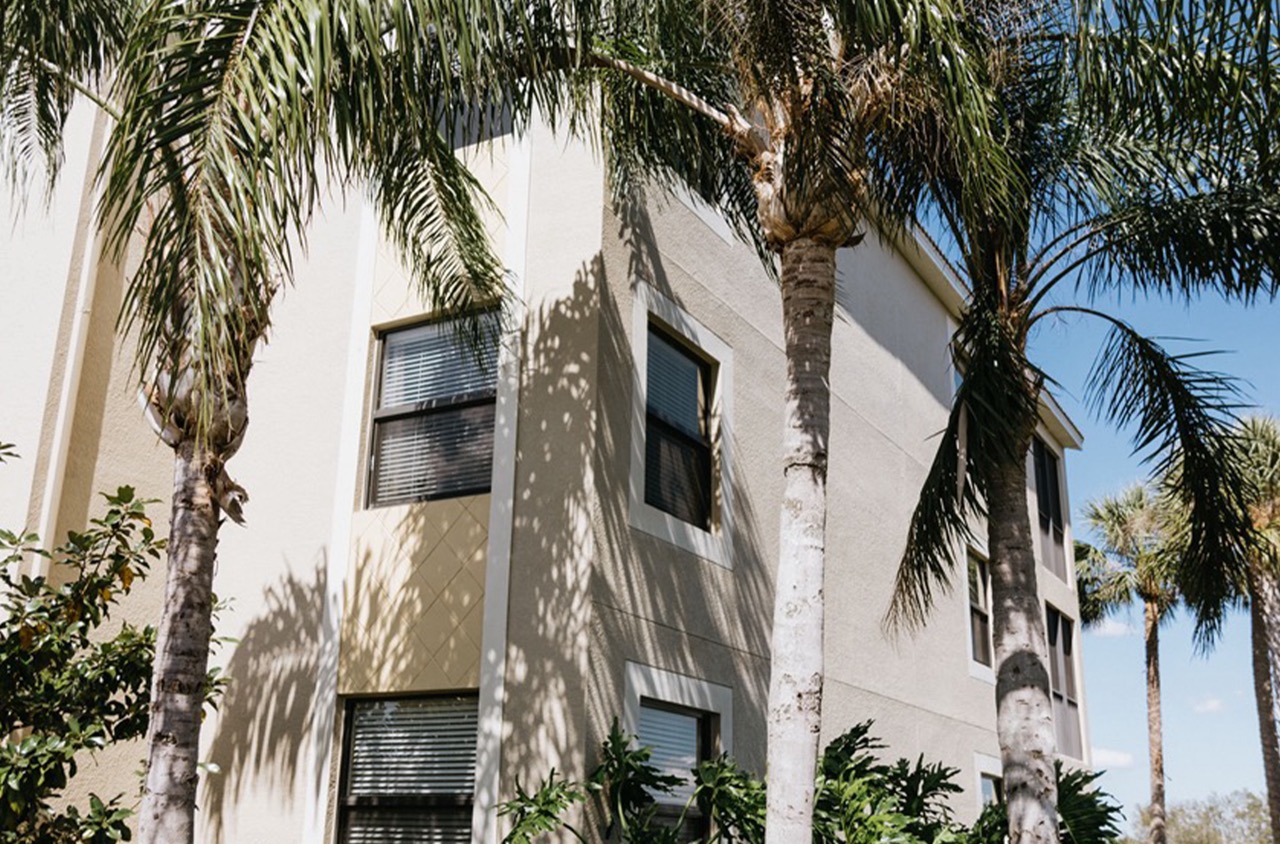
How does light intensity influence the colors on your walls? The way we perceive paint colors can be as much about lighting as it is about the hue itself. Light intensity can dramatically alter a room’s ambiance and affect the overall perception of space. In Sarasota and Manatee Counties, where the sun shines brightly, understanding and optimizing light intensity can transform both residential and commercial spaces. A color that appears vibrant and energetic under direct sunlight might seem muted under artificial lighting. Conversely, shadows in dimly lit areas can add unexpected depth to the paint’s texture and tone. This interplay between light and color is vital for anyone considering a new interior or exterior paint job. By strategically adjusting light sources, you can highlight architectural features, enhance mood, and even influence productivity in commercial settings. Delving into light intensity’s impact helps homeowners and business owners make informed decisions, ensuring robust aesthetic success in their projects.
Defining Light Intensity’s Impact
Light intensity goes beyond merely influencing the ambiance of a space; it plays a crucial role in how colors appear and can significantly affect mood and productivity. When planning a painting project for either residential or commercial spaces, understanding light intensity can help achieve the desired effects and functionality of the space.
In residential settings, the intensity and quality of light dictate the appearance of painted walls. Natural sunlight generally brings out the truest colors. For spaces with ample sunlight, consider cool shades like blues or greens as they complement natural light. Conversely, darker rooms might benefit from warmer hues like terracotta or amber to create a cozier atmosphere. Consider color testing by applying small patches of paint on a wall and observing how they look at different times of the day.
For commercial environments, light intensity strategically affects the space’s functionality. For example, brighter lighting in an office space is associated with increased productivity. Utilizing lighter shades like whites or pastels can enhance this brightness. In retail spaces, varying light intensities can impact how merchandise appears and should be accounted for when selecting wall colors. High-intensity LED lights might exaggerate cooler tones, making reds and oranges appear more vibrant.
Businesses should also assess how artificial light sources, such as fluorescent or incandescent bulbs, impact color palettes. Fluorescent lights often emit a cooler tone, which might clash with warmer paint colors, making them appear washed out. Incandescent lighting, on the other hand, can create a warm, inviting glow, enriching reds and oranges.
It’s also worth considering the finish of the paint. Gloss and semi-gloss finishes reflect more light, which can amplify its intensity, whereas matte finishes absorb light, which might be ideal for spaces you want to feel restful or subdued. For a practical experience, experiment with paint finishes under different lighting conditions in your environment. Understanding how light intensity interacts with color can be transformative in creating spaces that are both visually appealing and functional.
Adjustments for Lighting Types
Understanding the nuances of lighting types can significantly impact the effectiveness of your paint job. Lighting interacts with paint colors in distinct ways, often transforming the appearance of your space. A thoughtful approach to balancing lighting with paint can enhance mood, functionality, and aesthetics for both residential and commercial spaces.
Natural light varies throughout the day, shifting from soft, warm tones in the morning to bright, colder light at noon, and back to warm hues in the evening. Consider using paint with earthy tones or neutral colors in rooms that receive ample sunlight. These combinations complement the natural light spectrum, creating a harmonious atmosphere that feels balanced regardless of the time of day. For rooms with northern exposure, which can appear cooler, warmer paint shades can offset this effect.
Artificial lighting is another factor to consider, with options including LED, fluorescent, and incandescent bulbs each affecting paint colors differently. LED lights are energy-efficient and come in various color temperatures; selecting LEDs with warmer temperatures tends to make a room feel cozy with yellow undertones in the paint. Fluorescent lighting, often found in commercial spaces, can emit a cooler, bluish tone. For these environments, warmer wall colors, such as soft yellows or taupes, can soften the starkness. Incandescent bulbs have a naturally warm tone that enhances colors with red or yellow undertones, creating a welcoming ambiance.
Accent lighting—such as wall sconces or picture lights—can also highlight certain features within a space. By using a contrasting paint color on the accent wall, features can be emphasized under targeted lighting, providing a focal point. However, avoid excessive contrast, as this can overwhelm the visual balance.
Understanding how different lighting types interact with paint colors allows for more intentional design choices. By thoughtfully pairing paint with the appropriate lighting, you create environments that are not only visually appealing but also conducive to the desired function of the space.
Maximal Light Potential
Maximizing light potential can elevate the atmosphere and functionality of any space, be it residential or commercial. This approach focuses on utilizing both natural and artificial light to its fullest advantage, enhancing both aesthetic appeal and energy efficiency.
Incorporating light-reflective paint colors is a simple yet effective way to enhance lighting. Light colors, particularly shades of white and pale hues, reflect more light compared to darker ones, creating an illusion of spaciousness. Opt for a satin or semi-gloss finish for walls and ceilings, as these finishes reflect more light than matte paints. For offices or retail spaces, this approach can transform an area into a vibrant and inviting environment, encouraging productivity and comfort.
Consider the strategic placement of mirrors. This cost-effective tool provides depth and distributes natural light. Place mirrors adjacent to windows or opposite light sources to amplify light throughout the room. In commercial spaces, large mirrors can be both functional and visually pleasing, doubling as decor.
Natural light is invaluable if harnessed correctly. Clean windows frequently to allow maximum light penetration. Use sheer drapes instead of heavy curtains to let more light in while maintaining privacy. Skylights or strategically placed windows can be excellent investments in spaces lacking sufficient light. They not only brighten interiors but can also help reduce the need for artificial lighting during daylight hours, cutting energy costs.
For artificial lighting, layered light sources improve adaptability and ambiance. Combine ambient, task, and accent lighting to ensure well-lit spaces that adapt to various needs. In a retail setting, this can mean highlighting products more effectively, while in an office, it ensures appropriate visibility for different tasks. Utilize LED lighting for energy efficiency and longevity, selecting warm or cool tones depending on the atmosphere you wish to create.
Incorporating biophilic design elements, such as indoor plants, can further enhance light potential. Plants naturally soften harsh lighting and can create comforting, natural environments in both homes and offices.
Harnessing maximal light potential involves thoughtful consideration of color, materials, and strategic placement. These changes can significantly transform a space, improving not only the aesthetics but also energy efficiency and occupant well-being.
Next Steps
Understanding the nuanced relationship between light intensity and paint colors grants you the power to shape spaces that reflect purpose and aesthetic vision. Whether your space is bathed in natural light or relies heavily on artificial sources, the colors you choose will have a dramatic impact on mood and functionality. In industrial or retail settings, these subtle interactions can steer productivity, engagement, and customer perception. In residential environments, your choice influences comfort and ambiance.
Evaluating how both natural and artificial lighting interact with different hues equips you to create a balanced and vibrant setting. Embrace bright pastels to enhance natural light or opt for deeper hues for areas with reduced lighting. Finishes also matter; semi-gloss can be engaging while matte provides a sense of calm.
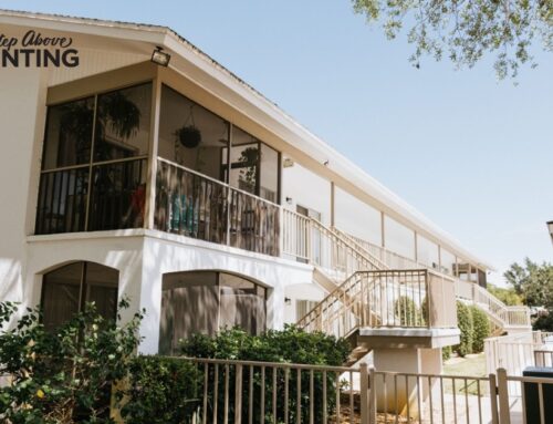
For bespoke solutions that consider how lighting affects your space, reach out to A Step Above Painting. Our experienced team can guide you through selecting the best paint options tailored to your unique environment. Contact us today for a free quote or consultation, and let us help transform your vision into a reality that captivates and inspires.
