

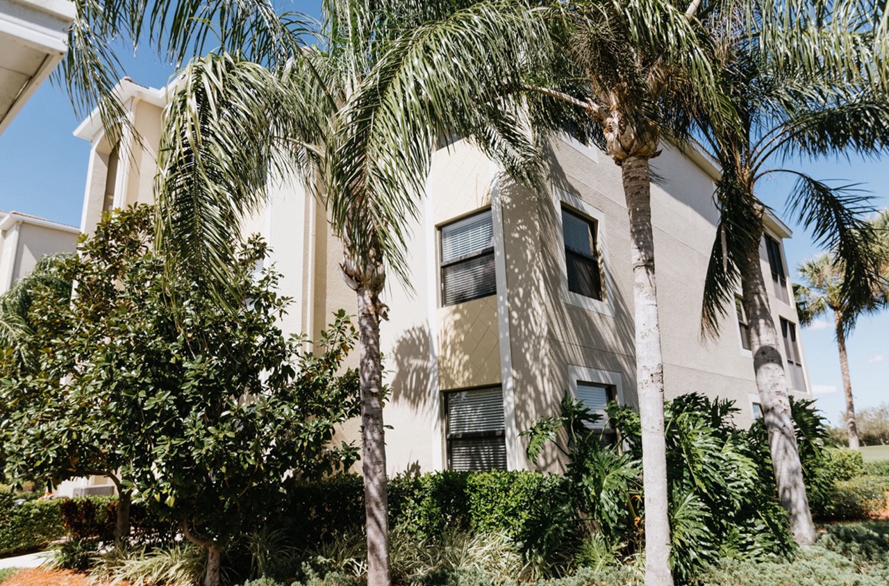
Choosing paint colors can transform a space, but it’s easy to take a wrong turn. One frequent misstep is underestimating the impact of natural light. Colors can vary dramatically in different lighting conditions, and a shade that looks perfect in morning light might appear drastically different at dusk. Another mistake involves ignoring the room’s existing elements, such as furniture, flooring, and fixtures. These components will influence how a color reads in a space, and failing to consider them can lead to a jarring mismatch. Additionally, attempting to follow trends blindly without considering personal preference or the overall flow of your home can result in regret. Selecting colors that don’t resonate personally can make a space feel disjointed rather than cohesive. Understanding these common pitfalls helps ensure that color choices enhance rather than detract from the beauty and harmony of your spaces.
Common Mistakes in Choosing Paint Colors
Choosing the right paint colors may seem straightforward, but it often involves more complexity than selecting a favorite shade. Avoiding common mistakes can elevate the ambiance and cohesiveness of your spaces, whether residential or commercial.
One prevalent error is neglecting the room’s lighting. The natural and artificial light sources impact how colors appear. A color that seems vibrant in a paint store might look muted in a room with limited light. Test swatches at different times of the day to see how changes in lighting affect the color’s appearance.
Another common mistake is rushing the decision. Paint colors should never be chosen solely from memory or online images. Physical paint chips and sample paints allow for tactile and visual accuracy. Apply sample patches on the walls and observe them in various lighting conditions to grasp their true effect.
Overlooking the room’s purpose often leads to selecting colors that do not align with the intended vibe. Soft, calming colors work well for bedrooms, aiding in relaxation, while vibrant colors might energize a workspace or lively restaurant area. Always match the color choice with the function of the space.
Ignoring existing elements in the space can cause color mismatches. Take into account any fixed design elements like flooring or countertops that cannot be easily altered. A neutral color palette with strategic accents can complement rather than clash with these features.
Lastly, be wary of color trends that do not resonate with your brand or personal style. Color trends come and go, but a timeless palette ensures longevity and relevance. Consistency in color schemes enhances brand identity in commercial settings and creates a cohesive design language in residential spaces.
By avoiding these common pitfalls, the process of selecting paint colors becomes more intentional and successful. Use these insights to create an environment that serves its purpose aesthetically and functionally.
Pitfalls of Skipping Samples
When planning a painting project for your business, samples might seem like an unnecessary step. However, bypassing this crucial phase can lead to a series of issues that can affect the overall outcome and appeal of your space.
One of the most common mistakes is selecting a color based solely on a small swatch or an online image. Colors can appear dramatically different in a digital format or under store lighting compared to natural light or the specific lighting conditions of your business location. Sampling allows you to see the paint in your actual environment. It’s an opportunity to observe how a color looks at various times of the day, under different lighting conditions. Skipping this step means risking a final color that clashes with your furniture, flooring, or branding.
Moreover, the finish of the paint—whether matte, glossy, or something in between—can affect the perception of color and texture. Each finish has its own way of reflecting light and can alter the look and feel of a room. Trying out different finishes on a sample patch provides insights that a color card cannot, helping to prevent dissatisfaction.
Another pitfall arises with underestimating paint coverage. A sample offers a sense of how many coats will be necessary, which is particularly important for bold colors. Skipping samples might mean not accounting for paint that behaves differently than expected once applied over the existing wall color, potentially leading to additional time and cost.
Finally, sampling ensures that the paint adheres correctly to the surface. Testing with a patch ensures that you have chosen the right primer and paint combination for a long-lasting finish. This step is invaluable in ensuring your investment doesn’t quickly deteriorate, risking the need for a complete repaint sooner than planned.
In essence, skipping samples might seem like a time-saver, but it often leads to larger problems down the line, impacting budget, timelines, and satisfaction with the final result. Taking the time to apply samples is a preventive measure that pays off significantly.
Incorrect Finish Choices and Their Impact
When opting for a paint finish, the decision can influence more than just the sheen of your walls. Each room in a building serves a distinct purpose, and selecting the appropriate finish enhances the space’s functionality. Misjudging this choice can lead to unexpected drawbacks.
In high-traffic areas like hallways and kitchens, using a flat finish might seem appealing due to its elegant, muted appearance, but it lacks durability. Flat paints are more susceptible to stains and are difficult to clean, making them unsuitable for spaces prone to scuffs and spills. Instead, opt for satin or semi-gloss finishes. These offer a slight sheen, which enhances scrub ability without compromising on aesthetics.
Conversely, employing a high-gloss finish in spaces intended for relaxation, such as bedrooms or living rooms, can be a misstep. High-gloss surfaces are reflective and can create unwanted glare under bright lighting. The finish also tends to highlight surface imperfections. Choose an eggshell or matte finish for these spaces to cultivate a soothing environment.
In commercial settings, making the correct finish choice holds particular significance. Offices and retail spaces that host client interactions should strike a balance between inviting and professional. A matte or satin finish can provide this equilibrium by offering a sophisticated look without sacrificing ease of maintenance.
Incorrectly choosing finishes in damp areas, like bathrooms or exteriors, can lead to further issues. Flat or matte finishes in these areas can absorb moisture, leading to peeling or mold growth. Hence, a semi-gloss or gloss finish is preferred due to its moisture-resistant properties. This choice not only enhances longevity but also reduces the risk of long-term damage.
Understanding the specific character of each finish can inform smarter choices, ensuring that your paint not only beautifies a space but also stands up to its environmental demands. This careful tailoring of finishes can preserve aesthetic appeal while accommodating the practical needs of the space.
Next Steps
In the journey of choosing paint colors, being mindful of potential mistakes can make a significant difference in achieving a harmonious space. Thoroughly understanding the interplay of light, existing design elements, and the nuances of paint finishes ensures that each room fulfills its intended purpose while maintaining aesthetic cohesion. This foresight not only protects your investment but also enhances the livability of your environment.
A Step Above Painting offers expert guidance to help navigate these choices, ensuring that the final result aligns with your vision and enhances your property’s appeal. Whether you’re updating a single room or undertaking a full renovation, our experienced team can provide tailored recommendations that respect your personal style and functional needs.
For Sarasota homeowners and businesses seeking a reliable painting partner, connect with ASAP Painting for a complimentary consultation. Experience firsthand how our expertise in color selection and finish application can elevate your project. Contact us today to schedule a free quote and transform your space with confidence and precision.
