

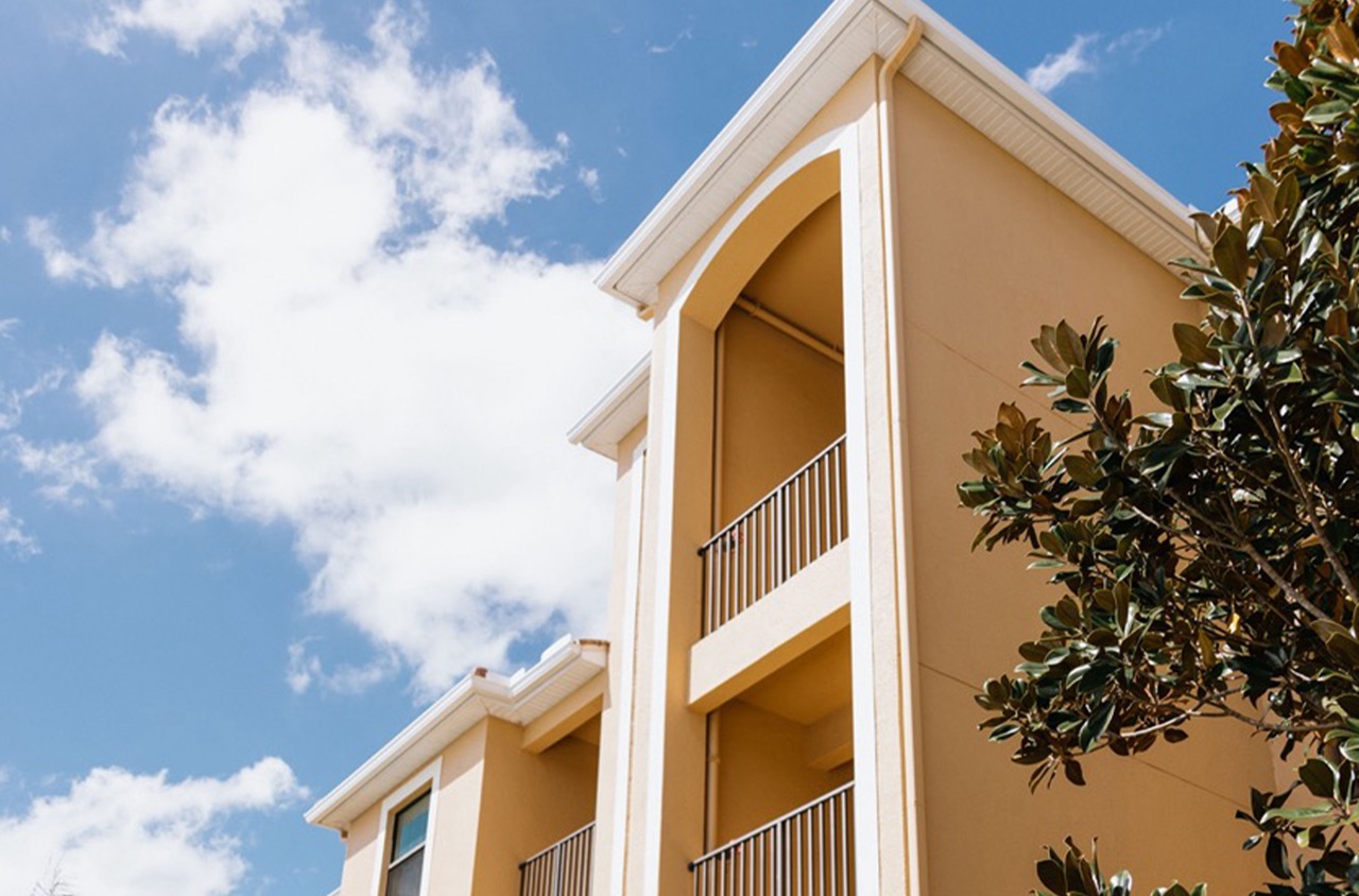
Choosing the right paint color for open spaces presents a unique set of challenges and opportunities. Open-plan designs require thoughtful color selections to create coherence while also allowing distinct areas to have their own identities. The role of color extends beyond aesthetic appeal; it influences perceptions of space, mood, and functionality. In residential settings, the right hues can delineate living areas, transform transitional areas like hallways, and bring harmony to multifunctional spaces. Commercial environments benefit similarly, using color to define zones within vast open areas, enhance brand identity, and improve worker productivity. The psychology behind color choices underscores its power—warm tones like golden yellows and soft reds evoke energy, while cooler shades enhance tranquility and focus. Discovering how colors interact with natural and artificial lighting and how they affect spatial dynamics ensures that each part of an open space serves its intended purpose while maintaining a seamless flow throughout.
The Role of Color in Open Spaces
Color plays a crucial role in open spaces, impacting how people interact with and feel about their surroundings. In business settings, effectively using color can enhance mood, encourage communication, and elevate the overall experience. Understanding the psychological effects of colors and applying them strategically can make a noticeable difference in your open space.
Think about using cool colors like blues and greens to foster a sense of calm in expansive areas. Blue tends to evoke feelings of serenity and is often linked to increased productivity. Imagine office lounges where employees gather and exchange ideas; incorporating shades of blue can help create a tranquil environment that encourages focus and creativity.
Green signifies growth and harmony, which can be ideal in spaces that aim to promote collaboration. With areas intended for brainstorming sessions or meetings, a touch of green can inspire innovation and teamwork. Research shows that exposure to natural colors enhances mental clarity and reduces stress, which is beneficial for an open work environment.
Incorporating warm colors such as reds, oranges, and yellows can inject energy into a setting, which may be useful in areas designed for active engagement or socialization. Red is a powerful accent that stimulates passion and action, making it useful in creative studios or areas where dynamic activities take place. However, it should be used sparingly to avoid overwhelming the senses.
Orange, associated with enthusiasm, can encourage lively interaction. Painting communal areas or break rooms with orange can promote social interaction, making these spaces more welcoming. Yellow, often linked with happiness and optimism, works well in enhancing natural light and creating a cheerful atmosphere. Painting walls near windows or seating areas with light shades of yellow can boost positive energy and encourage friendly interactions.
Businesses should also consider how people transition between spaces. Using neutral tones to balance out bold colors can guide movement and ensure the flow from one area to another feels natural. By paying attention to the role color plays in open spaces, businesses can craft environments that not only look appealing but also function to meet their objectives.
Psychological Impact on Space Perception
Color has a profound influence on how we perceive space. In residential and commercial settings, choosing the right colors can alter the mood and functionality of a space. Understanding this psychological impact is vital for any business or homeowner looking to optimize their environment.
Light colors such as whites, soft grays, and pastels can create an illusion of spaciousness. They reflect more light, making rooms appear larger and more open. This effect is especially beneficial in small spaces where a sense of openness is desired. For businesses, this can improve customer comfort and encourage longer stays. For residents, it transforms cramped areas into relaxing atmospheres.
In contrast, darker hues like navy, forest green, or charcoal gray have a cozy, intimate effect. They absorb more light, which can make spaces feel smaller. While this might seem counterintuitive, dark colors are often used to create a warm and inviting environment. For commercial venues like cafes or boutiques, such an environment can entice customers to linger.
Psychological studies suggest that certain colors evoke specific emotions. Blue, often associated with calmness and tranquility, is ideal for spaces intended for relaxation, such as bedrooms or spas. Yellow, on the other hand, is energetic and lively, making it a great choice for creative areas like offices or art studios.
The choice of colors should also consider cultural perceptions. Some colors hold different meanings in different cultures, potentially impacting customer interactions in international business settings. A color that is inviting in one culture might be off-putting in another.
Accentuating specific areas with strategic color use can guide focus and movement within a space. Bright or contrasting shades can be employed to highlight architectural details or direct attention toward specific areas such as product displays or key features of a room. Balancing aesthetics with functionality through color is vital in creating an environment that aligns with the intended purpose and emotional response of the space.
Creating Visual Separation through Paint
Creating visual separation in spaces enhances functionality and aesthetics. Utilizing paint strategically can transform a room by delineating areas without the need for physical barriers like walls.
Start by considering the room’s activities. Identifying key uses will guide your color choices. For example, in an open-concept living area that merges kitchen, dining, and lounge spaces, distinct colors can create subtle boundaries. Using a warm, inviting hue for the living room can evoke a sense of comfort, while a cooler shade in the kitchen may suggest cleanliness and efficiency.
Contrast is key in achieving effective visual separation. Pair light colors with darker tones to draw distinct lines between different spaces. For instance, paint a feature wall in the dining area a rich, deep shade that contrasts with the lighter tones of connecting spaces. This technique makes each area feel unique and purpose-driven.
Accent walls play a vital role in visual separation. A single wall painted in a bold color can act as a focal point, dividing functions without physical barriers. This method works well in home offices or reading nooks within larger spaces.
Texture is another tool that adds depth and dimension. Consider using different paint types to create texture contrasts. Matte finishes absorb light, creating a warm feel, while glossy paints reflect light, adding vibrancy and life to active zones.
Harmony between colors is essential when achieving visual separation. Choose hues from complementary color palettes to maintain a cohesive feel throughout the space. Use slight variations in shade intensity rather than entirely different colors for softer transitions.
For commercial spaces, painting to achieve visual separation can guide customer flow or highlight specific areas. In a retail store, use bright, eye-catching colors for promotional sections, subtly leading customers toward new products.
Utilizing paint creatively for visual separation enhances the functionality and design of both residential and commercial interiors. The choice of color, contrast, and texture plays an integral role in defining spaces without the need for physical partitions.
Next Steps
The transformative power of color in open floor plans should not be underestimated. Strategic paint choices allow residents and businesses alike to craft inviting, functional spaces that resonate with the desired ambiance and purpose. As we’ve seen, colors can subtly define areas, direct attention, and infuse spaces with energy or tranquility without the need for walls or partitions. For homeowners looking to create a flowing yet distinct home environment, or businesses aiming to guide customer experience, color should be a cornerstone of design strategy.
Paint selection is not merely an aesthetic decision but a pivotal element in crafting spaces that function optimally for their intended use. Thoughtful color use can support organizational goals, enhance experiences, and contribute to an environment’s overall success.
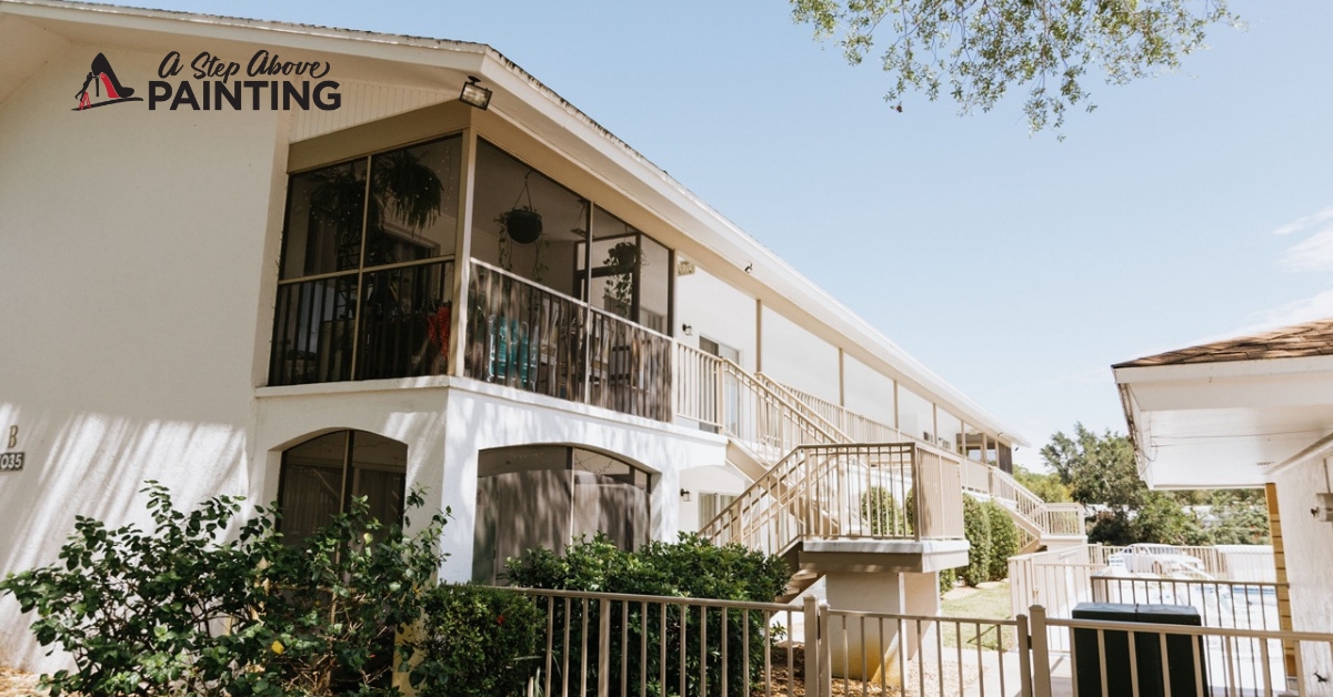
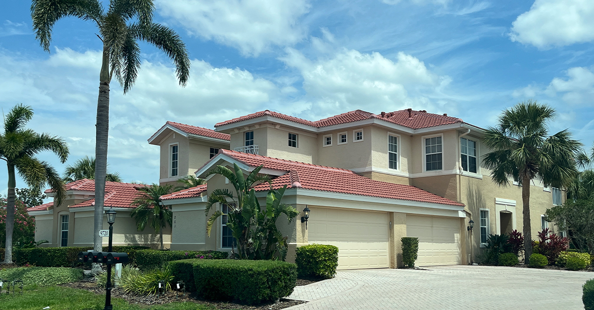
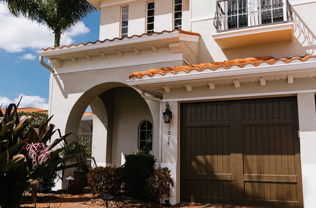
For those in Sarasota and Manatee Counties, looking to harness the power of color in your open spaces, A Step Above Painting offers expertise in creating cohesive and inviting environments. Contact us to discuss your space and obtain a free quote or consultation, ensuring every hue and shade enhances your open floor plan’s potential.
