

Why are there so many shades of white, and how do they impact your space? The subtleties within the realm of off-whites can dramatically influence the mood and perception of any room. While they all fall under this seemingly simple category, each variation offers a unique contribution to ambiance, aesthetics, and lighting interaction.
Off-whites carry hints of color that can evoke warmth or coolness, making them versatile choices for both residential and commercial spaces. A room painted in an off-white with a touch of yellow, for example, can create a welcoming and cozy atmosphere, ideal for living rooms or relaxing spaces. Conversely, incorporating a subtle blue undertone can infuse a sense of tranquility, perfectly suited for bedrooms or workspaces where serenity is key. The careful selection of off-whites can anchor a room’s design, balancing other elements such as furniture, artwork, and fixtures.
Understanding these nuances allows homeowners and businesses to choose paint colors that enhance architectural features and harmonize with surrounding environments. Through exploring tonal variation in off-whites, you can transform a blank canvas into a dynamic and inviting space.
Tonal Variation in Off-Whites
Understanding tonal variation in off-whites can significantly enhance any painting project, especially in residential and commercial spaces. Off-whites offer the clean simplicity of white while providing nuanced undertones that can subtly influence the mood of a room.
To begin, it’s essential to recognize what distinguishes one shade of off-white from another. Off-whites can carry undertones of gray, beige, pink, blue, or yellow. These undertones affect how a color appears under different lighting conditions and can have a surprising impact on the overall atmosphere of a space. For example, gray-tinted off-whites often create a more modern and sleek environment, whereas beige undertones lend warmth and coziness.
When selecting an off-white, consider the orientation and lighting of the room. North-facing rooms benefit from warm off-whites to counteract the lack of natural warm light. Conversely, south-facing rooms, which receive ample sunlight, might do well with cooler, grayish off-whites to balance brightness.
Practicality is also key. High-traffic areas, such as commercial spaces, might require off-whites with more pigmented undertones to reduce the visibility of dirt and wear. Painting a busy reception area, for example, in an off-white with a hint of beige can ensure the space remains welcoming while concealing minor imperfections that arise over time.
Additionally, harmonizing off-white choices with existing furnishings and decor is crucial. Furniture, flooring, and even artwork can affect how an off-white is perceived. Test samples in different areas, considering both natural and artificial lighting throughout the day. Observing how colors shift according to lighting changes can guide effective decision-making.
Lastly, off-whites can be versatile when it comes to creating transitions from one room to another. Using a consistent base color with varied undertones helps maintain cohesion while providing each area with a unique identity. With thoughtful selection, tonal variation in off-whites can transform interiors into cohesive, inviting environments.
Room Suitability
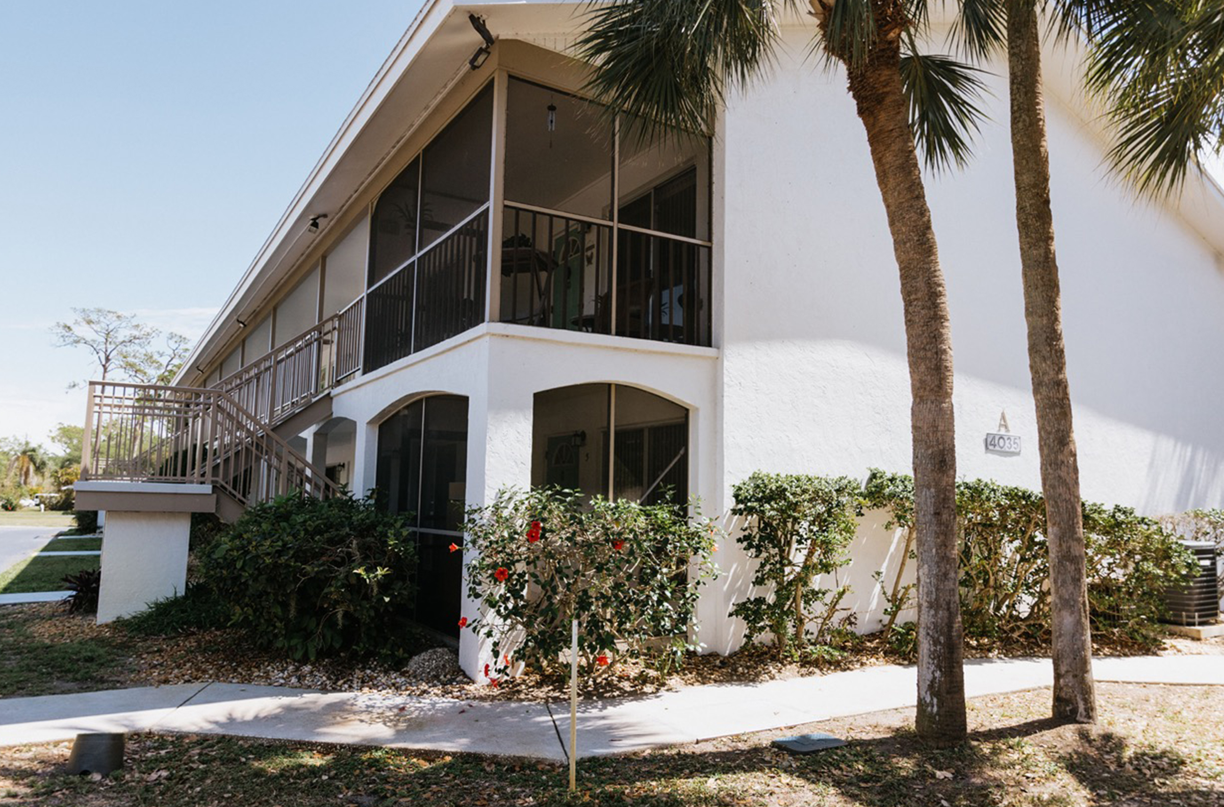
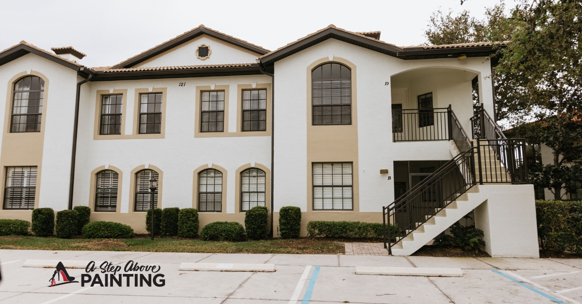
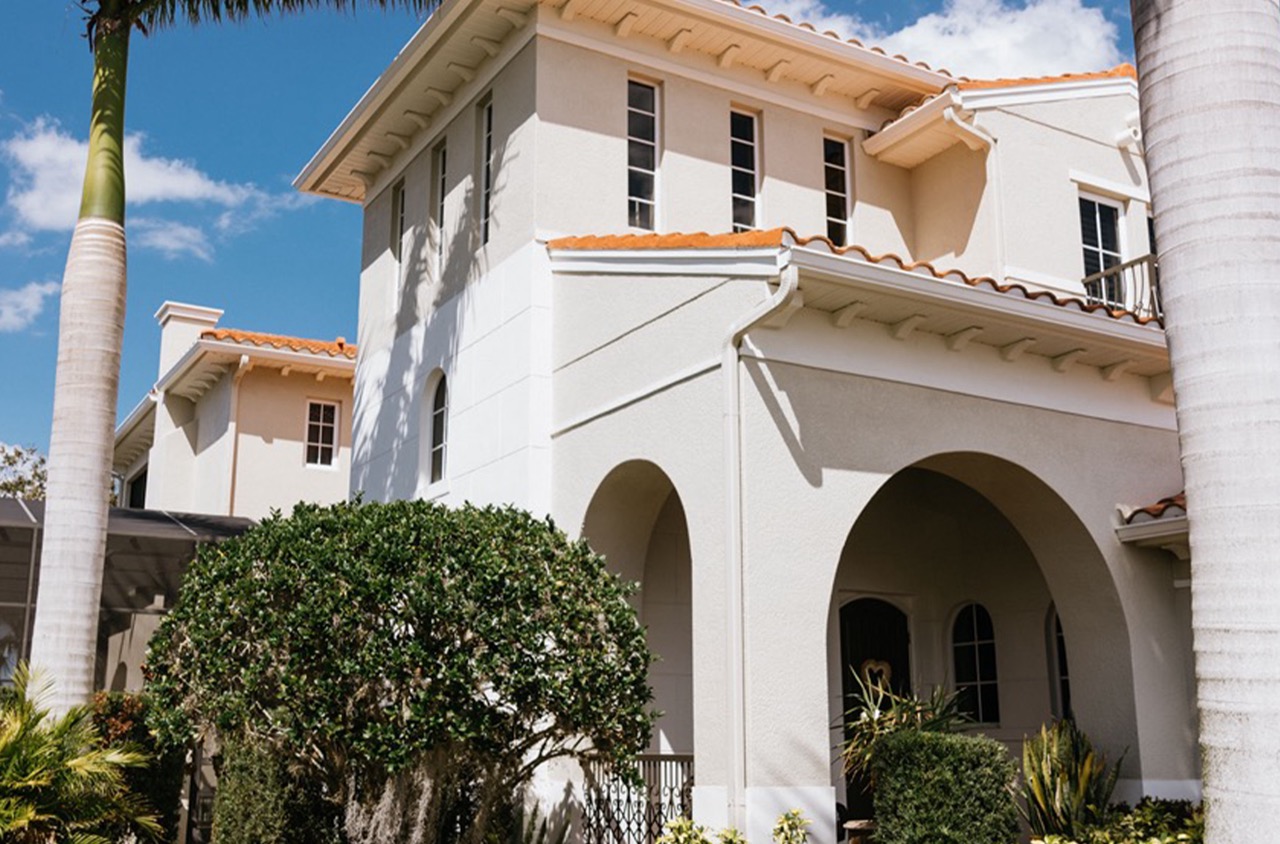
Selecting the right paint for a room isn’t just about choosing a color that catches your eye. It’s also about considering the room’s function, the effect you want to create, and even the lighting. For those in Sarasota and Manatee Counties, knowing how to choose paint that aligns with the unique Florida climate can make a difference in terms of longevity and appearance.
High-traffic areas like kitchens and bathrooms require durability. In these rooms, a satin or semi-gloss finish offers the strength needed to withstand frequent cleaning and moisture. The slight sheen in these finishes adds a level of resistance to stains and humidity, making them practical choices. In contrast, living rooms and bedrooms, where aesthetics might take precedence over function, can benefit from the soft, inviting feel of an eggshell or matte finish.
Consider the size and lighting of the room. Light colors can make a small space feel larger and brighter, reflecting natural light and adding a sense of openness. In contrast, darker tones can add warmth and coziness but might also make a space feel smaller. If a room has an abundance of natural light, colors like deep blues or rich greens can enhance its inviting feel. For spaces with limited lighting, lighter colors can compensate for the lack of brightness.
Another aspect is the existing décor. Paint should complement or subtly contrast with the furniture and flooring. It’s helpful to bring in fabric samples or photos of the room’s decor when choosing paint swatches.
Finally, don’t underestimate test samples. Paint a small section of a wall and observe how the color looks at different times of the day. Colors can dramatically change with the shift in natural or artificial lighting, so this simple step can prevent costly mistakes.
By considering these factors, room suitability and paint choice become less of a haphazard decision and more of a strategic step toward creating spaces that are both beautiful and functional. Proper planning ensures the final result fits the intended purpose of the room.
Pairing with Warm and Cool Accents
When creating a dynamic and inviting space, the strategic use of colors can transform a bland area into a masterpiece. One effective method to achieve this transformation is by harmonizing warm and cool accent colors. This approach not only enhances the aesthetic appeal but also allows for a balance that can suit different moods and functions within a space.
Warm colors, such as reds, oranges, and yellows, are known for their energy and vibrancy. They can make a room feel cozy and inviting, perfect for gathering spaces like living rooms and dining areas. To avoid overwhelming the senses, these bold hues can be balanced by introducing cool accents. Cool colors like blues, greens, and purples bring a sense of calm and serenity, providing contrast that tempers the energy of warm tones.
A practical tip is using the 60-30-10 rule. This rule suggests that 60% of a room should be a dominant color, 30% a secondary color, and 10% an accent color. For example, you might choose a soft blue as the dominant color, a warm beige as the secondary, and touches of rich orange as accents. This combination maintains balance while allowing pops of vibrant color to keep the space lively.
Textures also play a role in the interplay between warm and cool tones. In a room painted with cool hues, introducing warm textures through materials like wood or brass can add warmth. Conversely, a space with warm walls might benefit from cool metallic or glass accessories to create contrast.
Lighting is another factor to consider. Natural light tends to enhance warm colors, making them appear more vivid. In poorly lit rooms, integrating cool accents can enhance the artificial lighting, providing better overall illumination.
Incorporating warm and cool colors thoughtfully not only enhances the aesthetic appeal of a room but also creates an atmosphere that reflects the purpose of the space. By balancing these colors, any room can be transformed into a harmonious and unique environment.
Next Steps
Incorporating off-whites into your design can drastically elevate your space, moving beyond simple neutrality to introduce sophistication and nuance. The right off-white can complement a spectrum of accent colors and materials, bringing out the best in both bold statements and subtle details. This chameleon-like quality of off-whites allows them to adjust under various lighting conditions, making them incredibly versatile and effective in shaping mood and space dynamics.
Applying an understanding of tonal variation, room suitability, and pairing strategies can create an environment that is both cohesive and inviting. Whether modernizing a sleek office space or adding warmth to a cozy home, off-whites serve as a reliable foundation for building memorable environments.
As you begin your next painting project, consider allowing ASAP Painting’s expertise to guide you through the selection process for the perfect off-white. Our team can help you navigate these nuances to create a space that is not only visually striking but also perfectly tailored to your needs. We invite homeowners and businesses in Sarasota and Manatee Counties to contact us for a free quote or consultation to ensure your painting venture achieves its full potential.


