

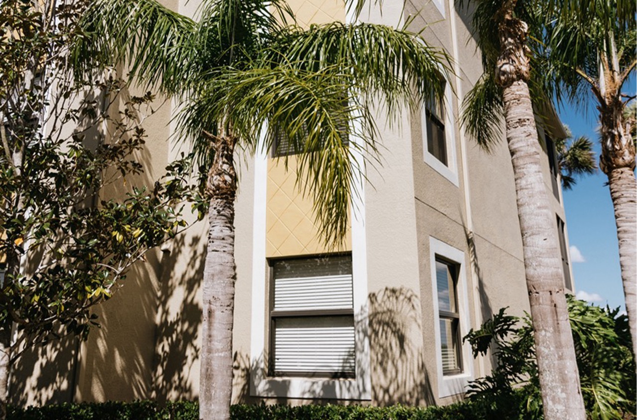
Imagine walking into a room where the walls capture the exact hue of your favorite beach sunset or match the subtle tones of your cherished antique lamp. Achieving this level of aesthetic harmony hinges on the art of custom color matching, a process that goes beyond simple color selection. Custom matching involves a methodical approach, leveraging technological precision and artistic insight to create colors that resonate with your specific vision. This practice allows for exact replication of a desired shade, perfect for highlighting architectural features or aligning with existing decor. Whether it’s matching a new room addition to the rest of your home or ensuring that a commercial space reflects a brand’s identity, custom color matching is a crucial aspect of achieving a cohesive and inviting environment. Understanding this process empowers you to transform spaces with colors that not only complement their surroundings but enhance the overall visual impact.
The Process of Custom Matching
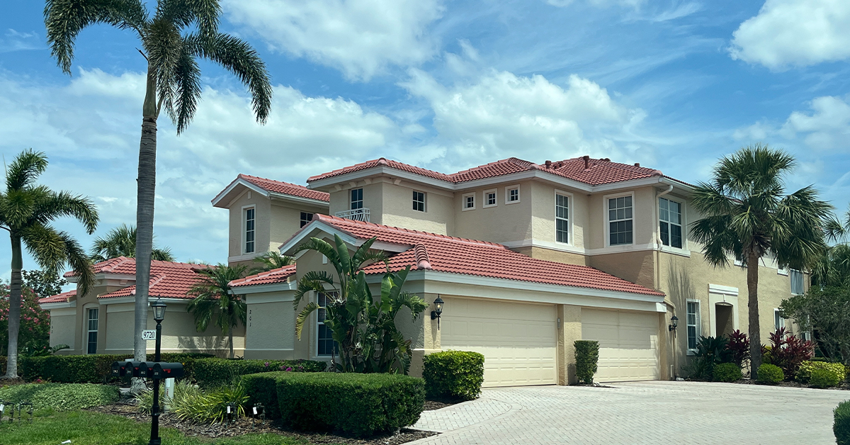
Creating a custom color match for painting requires a keen eye and attention to detail. It’s more than just mixing paint; it’s about crafting a hue that speaks to the identity of a space, whether it’s a home or a business. A perfect color match provides a room with harmony, whether complementing architectural features or making a bold statement.
Begin by thoroughly inspecting the area intended for painting. Observe how lighting affects colors throughout the day. Natural light can change a paint color’s appearance significantly. Test small samples in various parts of the room to see how different lights influence the tone.
Next, utilize technology to aid precision. Handy devices like colorimeters or advanced apps can scan an existing color and provide a detailed match suggestion. These tools are particularly useful for businesses seeking to replicate brand colors consistently across various locations.
However, technology should complement human expertise, not replace it. Eyes can distinguish subtle nuances that technology might miss. It helps to have a keen understanding of color theory—knowing how to mix primary colors to achieve a desired shade. If replicating a fabric or an object, hold it against paint swatches under the same light conditions.
When mixing paints, create a formula that includes exact proportions of each pigment. Documenting this process ensures that the shade can be recreated precisely in the future. Keep in mind the type of paint; the sheen of matte, eggshell, or gloss can alter perceived color slightly.
Regularly test the custom mix by painting small, hidden sections to examine true color results as they dry. Adjust if necessary, paying close attention to undertones. Engaging in this thorough matching process allows businesses to maintain their aesthetic continuity effectively, which can be crucial for brand recognition and ambiance.
Custom matching is a fusion of science, art, and skill, resulting in a tailored color palette that elevates a space’s visual appeal.
When to Use Custom Colors
Selecting the right colors is crucial for businesses aiming to make a lasting impression. In commercial spaces, colors can influence mood, customer perception, and even purchasing decisions. Understanding when to use custom colors can enhance your brand identity and create an inviting atmosphere for clients and employees alike.
Custom colors are beneficial in environments where brand consistency is key. If your business has a specific color scheme, making sure these colors are incorporated into your building’s palette will reinforce your brand’s visual identity. Think about places like reception areas, waiting rooms, or storefronts where clients form their first impressions. Custom colors that reflect your brand can communicate professionalism, trust, and attention to detail.
Another strategic use of custom colors is in creating functional zones within an open space. Different shades can delineate areas for various business activities without the need for physical barriers. For example, you might use softer, more muted tones for quiet, focused workspaces and vibrant colors in collaborative areas to stimulate creativity and interaction.
Consider seasonal changes and lighting conditions when choosing custom colors. A hue that looks appealing in natural sunlight might lose its charm under artificial lighting. Testing paint samples in the intended setting will prevent any unwanted surprises once the project is completed.
Create a harmonious balance by integrating accent colors that complement your custom base. This approach can add depth and interest to a room without overwhelming the senses. For instance, a well-placed accent wall or color-coordinated decor items can create visual appeal and draw attention to specific areas or features of your establishment.
Lastly, engage with the psychology of color to enhance the experiences of anyone who enters your space. Blue, for example, is often associated with calmness and can be ideal in health and wellness settings, while red, associated with energy, might be more fitting for a fast-paced retail environment. Consulting with professional painters who understand color theory can help you make informed decisions that align with your business goals.
Blending with Existing Interiors
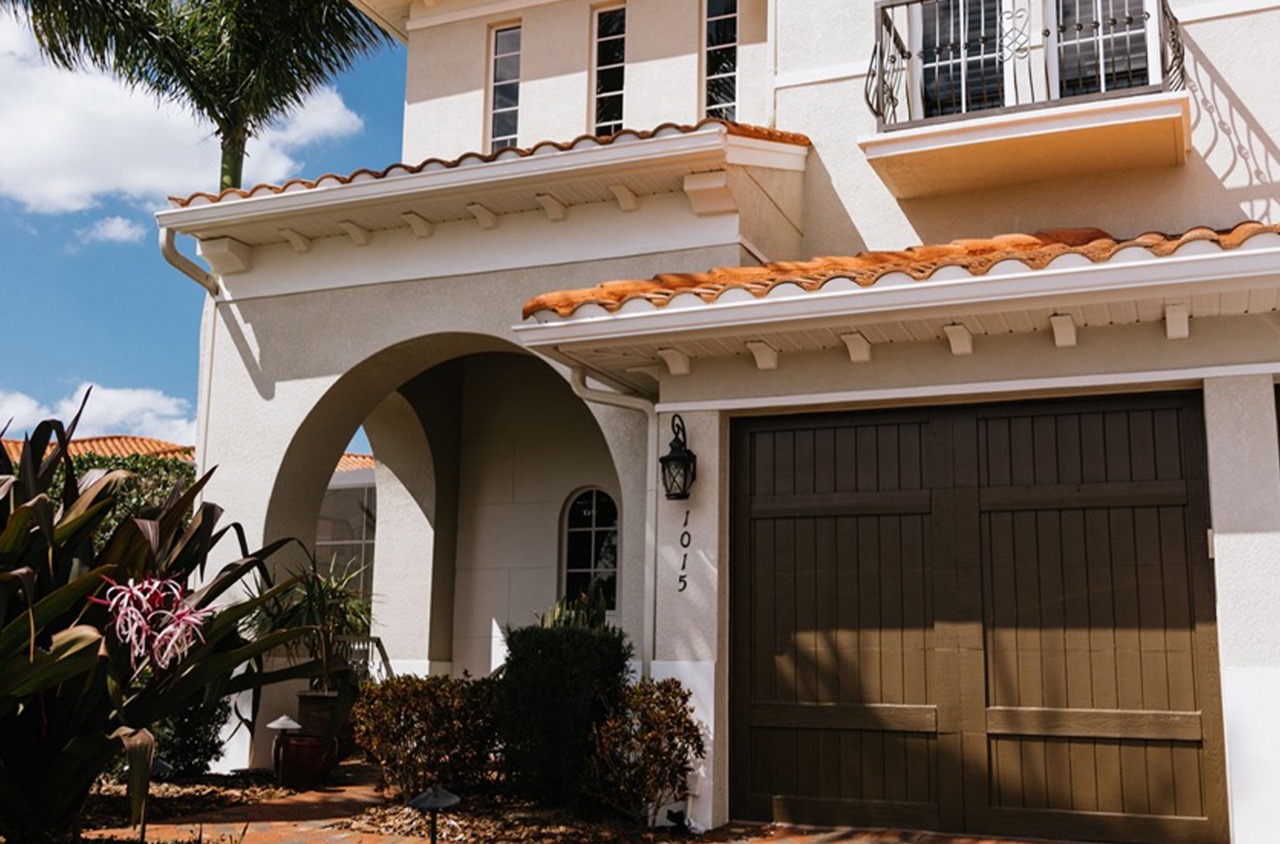
Blending a fresh coat of paint with your existing interiors is an art that balances creativity with practicality. When integrating new colors, it’s crucial to consider the hues and finishes already present in your space. This approach creates a cohesive look that enhances the overall ambiance of your home or business.
Start by evaluating the dominant colors in your room, such as those in furniture, flooring, or large-scale artwork. These elements often dictate the mood and tone of the space, serving as a guide for selecting complementary paint shades. If your furnishings are mostly neutral, you can introduce a bolder wall color for contrast, or you might opt for a subtle, matching shade for harmony.
Lighting plays a significant role in how paint looks on your walls. Natural sunlight, incandescent bulbs, and LEDs each bring out different undertones in paint colors. It’s advisable to test your chosen paint samples under various lighting conditions. Paint small swatches on your wall and observe them at different times of the day to see how they appear.
Another tip is to pay attention to paint finish. Different finishes, such as matte, eggshell, or satin, can either highlight imperfections or add a refined touch to wall surfaces. Matte finishes are suitable for low-traffic areas, offering a smooth, non-reflective look. Satin and eggshell, on the other hand, provide more durability and are easier to clean, making them ideal for high-traffic spaces.
Additionally, consider the psychological effects of colors within spaces. Soft blues and greens often evoke tranquility, making them suitable for bedrooms or waiting areas. Meanwhile, vibrant colors like reds and oranges can stimulate energy and work well in dining rooms or creative spaces.
Incorporating paint that blends well with existing interiors involves careful selection and testing. This thoughtful approach can enhance the aesthetic value of any space while ensuring harmony with your existing decor. Selecting the right balance between color, finish, and lighting is key to a successful transition.
Next Steps
Custom color matching is an essential practice for achieving both aesthetic appeal and functional harmony in any space. Whether blending with existing decor or crafting a unique brand identity, the right color can redefine environments. It requires a combination of technical skill and an understanding of color dynamics to meet and enhance specific design goals. By thoroughly inspecting lighting conditions, employing precise technological tools, and applying an experienced eye, you can achieve a near-perfect color match that both complements and elevates the space.
Your choice in colors influences not just appearance but also mood and behavior. From creating calming atmospheres with cool tones to stimulating environments with warm shades, the palette you choose plays a significant part in shaping perceptions and interactions within your environment. Including accent colors introduces depth, drawing attention to architectural details and enhancing the visual appeal of the space.
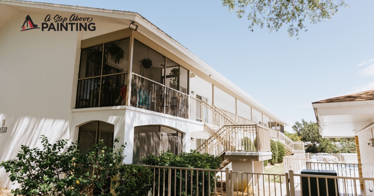
For personalized advice on how to bring your vision to life with custom color matching, or to ensure consistency in brand representation through strategic color use, contact A Step Above Painting. A free consultation will guide you through the myriad possibilities to achieve a stunning, cohesive look tailored to your needs.

