

Every masterpiece begins with a well-prepared canvas. In painting, setting the right background conditions can be the difference between a project that stands the test of time and one that quickly fades away. Preparing surfaces adequately involves more than just choosing a color—it’s about ensuring that the paint adheres properly and looks immaculate for years. This means addressing issues like moisture, humidity, and surface texture beforehand, particularly in environments such as Sarasota and Manatee counties, where the coastal climate presents unique challenges. By understanding the nuances of preparation, you set the stage for a sturdy, vibrant finish that enhances both the beauty and longevity of your space.
Setting the Right Background Conditions
In painting, the choice of color, technique, and materials matter significantly, but often overlooked is the setting of appropriate background conditions. Creating the right backdrop in painting endeavors, both residential and commercial, lays the foundation for quality results. This phase includes preparation, lighting, and environment control, each a cornerstone for successful application.
Before painting, clean surfaces rigorously. Dirt and grime adherence compromises paint adhesion, leading to patchy appearances and reduced longevity. Utilize a mix of water and mild detergent for most surfaces, applying with a sponge or soft cloth. Follow with a rinse and ensure the wall is completely dry. Surface imperfections such as cracks or holes should be addressed with spackling paste, ensuring an even finish. In commercial spaces, additional measures like mold removal might be necessary, as excess moisture can affect productivity by creating an unhealthy environment.
Lighting is pivotal. Evaluate the space under various lighting conditions to see how colors shift. Natural light showcases true hues, while artificial lighting can alter perceptions, potentially leading to dissatisfaction post-project. For commercial zones, adopting a consistent lighting strategy during planning ensures the color reflects accurately in everyday use.
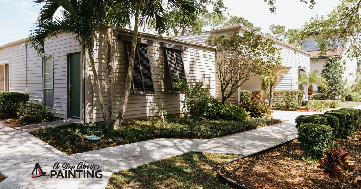
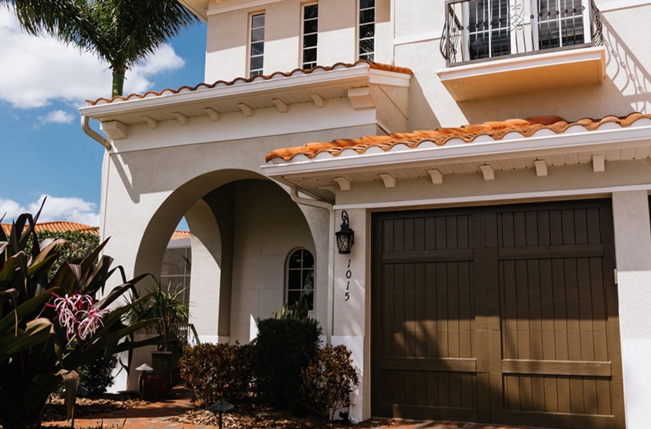
Temperature and humidity influence paint quality, especially in humid climates like Sarasota and Manatee Counties. High humidity slows drying times and may lead to streaking. The ideal scenario is moderate temperatures with low humidity. Use dehumidifiers or fans in interior settings to control conditions. If tackling exteriors, choosing early morning or late afternoon hours avoids intense sunlight that may prematurely dry the paint, affecting smoothness and sheen.
Painters must maintain organized workspaces, positioning tools and materials for efficient access, reducing downtime. This organization is especially critical on large-scale commercial projects, where disruption impacts operations and productivity. Placing drop cloths carefully protects floors and furniture, essential in both homes and offices where maintaining cleanliness is paramount.
By considering these elements, those painting in residential or commercial contexts will achieve superior finishes and more enduring results.
Planning Layouts
Creating a captivating layout for your commercial space involves strategic planning. A well-designed layout not only enhances aesthetics but also influences customer behavior, foot traffic, and employee productivity. Businesses that invest time and effort into strategic planning reap dividends in customer satisfaction and operational efficiency.
To start, it’s crucial to understand the purpose of the space you’re designing. Retail stores, for instance, might prioritize maximizing product visibility, while office spaces might focus on collaborative areas that encourage communication among teammates. Identifying these priorities can guide the rest of your planning.
Consider traffic flow, which influences how people move through a space. In a retail setting, the layout should facilitate a natural path for customers to follow, potentially increasing the chances they’ll explore all areas. Think about wider pathways in crowded sections and how display zones can capture attention without interrupting flow.
Lighting plays an indispensable role in layout planning. Natural light is not only energy-efficient but can also set a positive mood, making spaces feel comfortable and enlarging them visually. Where natural light is limited, smart layering of different types of artificial light can enhance visibility and ambiance. Accent lighting on specific areas or items draws focus and can guide movement subtly.
Experiment with zoning. By creating distinct zones, you help specify the function of different areas within a larger space. Open-plan offices benefit from this approach, utilizing zones for focused workstations, casual meeting spots, and relaxing break rooms. Each zone can have its distinct color scheme or style to reinforce its purpose.
Always think vertically. Utilizing vertical space is crucial, especially in rooms with limited square footage. Wall shelving, hanging decor, and tall plants can draw the eye upward, maximizing visual space without cluttering the floor.
Through thoughtful design, your commercial space can be both functional and transformative, driving better customer experiences and enhancing workflow.
Complementary vs. Contrasting Choices
Selecting the right color scheme for your business can impact customers’ perceptions and even influence their decisions. Understanding the differences between complementary and contrasting choices will help you create an inviting and memorable atmosphere.
Complementary colors are those located directly opposite each other on the color wheel, like blue and orange or red and green. When used in design, they enhance each other’s intensity, creating vibrant and dynamic spaces. For businesses, these color combinations can evoke excitement and energy, making them suitable for environments that aim to engage and attract attention. For example, a trendy café could use teal walls with coral accents to stimulate appetite and conversation. However, using too many bright complementary colors together can overwhelm, so it’s useful to balance them with neutral shades to maintain a welcoming vibe.
Contrasting colors, on the other hand, involve stark differences in hue or brightness but do not necessarily lie opposite on the color wheel. Black and white is the most evident contrast, providing a classic and timeless aesthetic perfect for businesses seeking a sophisticated look. Contrasting palettes can illuminate focal points within a space, highlighting product displays or key features. Retail stores often use light and dark colors together to guide customers’ eyes towards specific merchandise, subtly influencing buying behavior.
When selecting a color scheme, consider the purpose of your business space and the mood you wish to cultivate. If your goal is to energize and inspire, complementary combinations will likely serve you well. If your business aims for understated elegance or simplicity, contrasting choices might be the better route.
It’s crucial to regularly analyze feedback from clients and employees regarding the atmosphere’s effectiveness. Adjustments over time ensure the space remains engaging and aligned with your brand’s identity.
Next Steps
Successfully creating a gallery wall involves more than just curating the artwork; the surrounding paint colors play an integral role in the viewing experience. Paint colors can either complement or contrast with the art, affecting how each piece is perceived.
When selecting paint colors, consider choosing subdued tones that allow the artwork to take center stage. Neutral shades like soft grays, beiges, or whites offer a timeless backdrop, ensuring that the art remains the focal point. These hues can subtly enhance the colors within the art, creating an effortless harmony.
Alternatively, for galleries aiming to make a bolder statement, contrasting wall colors can bring out specific art elements, making them pop. Deep, rich colors like navy or charcoal can add drama and make brighter pieces stand out. This approach is beneficial for highlighting specific textures or color palettes inherent in the art.
Optimal lighting should accompany your color choices. Both natural and artificial lighting affect how colors are perceived, impacting the visibility and vibrancy of the artwork. Consider adjustable lights to modulate the intensity and direction, ensuring each piece is showcased effectively at different times of day or evening.
If the array of choices seems daunting, consulting with an expert can streamline the process. At A Step Above Painting, we bring expertise in both color selection and application, ensuring your gallery wall achieves its envisioned impact. Contact us for a free quote or consultation to see how we can elevate your space with our professional painting services.


