

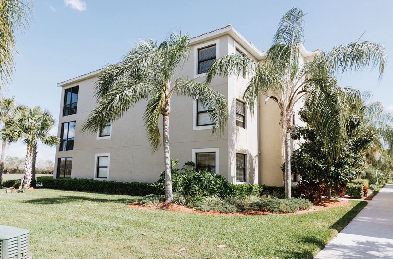
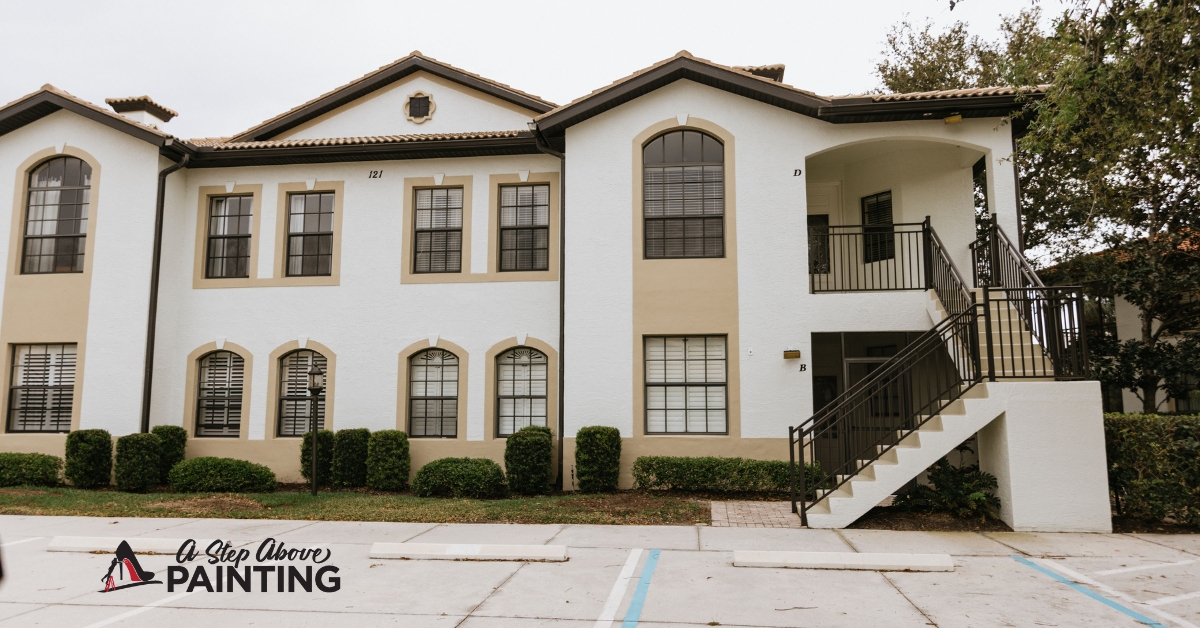
When considering a fresh coat of paint for your property, it’s essential to think about how various elements will harmonize together. The concept of integration in painting doesn’t just apply to color schemes but also encompasses texture, style, and design. How do you ensure that your chosen palette complements both the architecture and the surrounding environment? Integration in painting offers the opportunity to bring together all the aesthetic components of a space to create a visually coherent whole. For example, selecting hues that reflect natural elements found in Sarasota and Manatee Counties can seamlessly connect your interior or exterior spaces with the lush, vibrant Florida landscape. Additionally, textures, such as matte or satin finishes, can be integrated to enhance or subtly balance the existing architecture. Understanding your integration options allows you to craft spaces that are not only personalized but also aligned with the broader context of your property. Here, we delve into the nuances of integration, offering insights that can help you transform any painting project into a cohesive and beautiful outcome.
Focus on Integration Options
Incorporating painting projects into your business strategy can lead to a revamped workspace that enhances both employee productivity and customer experience. Integration refers to blending new painting projects seamlessly into operational plans, without disrupting the daily flow of the business.
Start by identifying key areas that could benefit from a fresh coat of paint. High-traffic areas like reception, conference rooms, and hallways are prime candidates. New colors can drastically change the atmosphere, making spaces feel more inviting or professional. Consider color psychology: blues and greens for calmness, or vibrant yellows and reds for energy.
Next, develop a schedule that accommodates these projects. Depending on your operational hours, it might be wise to have painting done during off-peak times or after business hours to minimize disruption. Effective planning ensures minimal disturbance, maintaining the business’s efficiency while enhancing the space.
Budgeting plays a crucial role. Before initiating a project, allocate a budget for materials, labor, and unexpected expenses. To keep costs in check, seek quotes from multiple contractors and assess their quality of work and reliability. Remember, a slightly higher cost for quality paint can save money in the long-term by reducing the need for frequent repaints.
Engaging employees in the process can also be beneficial. Allowing them to have input on color selections or design may boost morale and sense of ownership. It’s also useful to communicate clearly about the timeline and workspaces affected. This transparency helps manage expectations and mitigate temporary inconveniences.
Lastly, evaluate how the newly painted areas meet the business’s aesthetic and functional needs. Gather feedback to understand if goals, such as improving mood or creating a coherent brand image, are met. This assessment can inform future projects, ensuring improvements align with business objectives.
By focusing on these integration strategies, businesses can effectively manage painting projects while enhancing the overall work environment.
Harmonizing Treatments & Paint
Creating a visually pleasing and efficient space involves harmonizing treatments and paint. A well-thought-out approach ensures a room’s aesthetic and functional success.
To begin, consider the room’s purpose and mood. For a calm atmosphere, use soft, muted colors like blues and greens. For an energizing space, opt for warm hues like yellows and oranges. Observing the color psychology can pave the way for a perfect selection.
Balance is key in blending curtains, blinds, and other treatments with wall colors. If your walls are bold, choose treatments in neutral or subtle tones. Conversely, bright or patterned treatments can add interest to muted walls. For instance, white walls can sharply define spaces unless paired with vibrantly patterned curtains, which add texture and depth.
For those venturing into the commercial setting, think about branding. Harmonize your business’s signature colors into your interior. An office with a sleek black and white color scheme might integrate treatments with a touch of the company’s accent color, maintaining professionalism with a nod to brand identity.
Texture and finish should not be overlooked. Matte paint offers a soft, understated finish that works well with textured treatments like linen or wool. Glossy paint, providing a sharper appearance, pairs effectively with smoother treatments such as silk or satin. The interaction between textures can make or break the design.
Lighting plays a crucial role. Natural light can reveal the true character of both paint and treatments. Observe how the colors interact with the light throughout the day. South-facing rooms may benefit from cooler tones, which counterbalance the warmth, while north-facing areas might need a touch of warmth brought by yellows or creams.
Consider additional elements, such as rugs and artwork, to create coherence. A rug that picks up hues from both the wall and treatments can tie the space together effortlessly, while strategically placed artwork can accentuate the chosen palette.
Through thoughtful coordination of paint and treatments, a space becomes more than just a collection of items but a cohesive story. This harmonization challenges one to think beyond traditional applications, offering numerous paths to achieving design goals.
Patterns and Texture Play
Patterns and textures are powerful elements in interior and exterior painting, enhancing the visual appeal of any space. Integrating these features into business environments can not only refresh a room but can also promote an inviting and engaging atmosphere.
Patterns can establish a rhythm within a space, guiding the eye and adding depth to commercial interiors. Striped patterns, for example, can be used in narrow spaces to create an illusion of more space, either extending height or width depending on the direction. For those looking to make a statement, geometric patterns can add a modern twist, while also integrating brand colors subtly into a design.
When choosing patterns, consider the scale and proportion relative to the room. Large patterns in small rooms can feel overwhelming, while smaller, more intricate patterns can get lost in larger spaces. Opt for a balance that enriches rather than overpowers the space, keeping in mind the purpose of the room and the mood you wish to evoke.
Texture, on the other hand, brings tactile and visual complexity. In commercial settings, textured paint techniques like sponge painting, rag rolling, or sand textures can induce a sense of warmth and character. An office lobby with a textured accent wall, for example, can make a lasting impression on clients.
Considering different finishes also contributes to texture. Matte finishes are soft and understated, often used for their ability to hide minor wall imperfections. Glossy finishes, conversely, add elegance and can reflect light, adding vibrancy to a room. Choosing the right finish can be crucial depending on the traffic and usage of the area being painted.
Using patterns and textures thoughtfully can create a compelling and cohesive atmosphere that enhances workplace aesthetics. They can transform a regular workspace into one that stands out, instilling both employees and clients with a sense of pride and inspiration.
Next Steps
Thoughtful integration of window treatments with wall colors can significantly enhance the harmony and functionality of a space. The interplay of color, pattern, and texture between walls and treatments can either subtly support or boldly define a room’s character. By choosing complementary hues, you can seamlessly tie the room’s design elements together, aligning with both personal and brand aesthetics.
Incorporating patterns and textures should aim to engage the senses, create depth, and amplify both natural and artificial lighting. The strategic selection of finishes, whether matte or glossy, can further refine the visual narrative you’ve crafted, either by absorbing light for a warmer feel or reflecting it for a vibrant and polished atmosphere.
Engaging with professionals who understand the dynamics of color interaction and material selection is crucial for achieving desired outcomes in both residential and commercial settings. At A Step Above Painting in Sarasota and Manatee Counties, our team offers expert advice tailored to the essence of your space. Contact us today for a free quote or consultation, and discover how our painting solutions can elevate your environment’s aesthetic and functional potential.


