

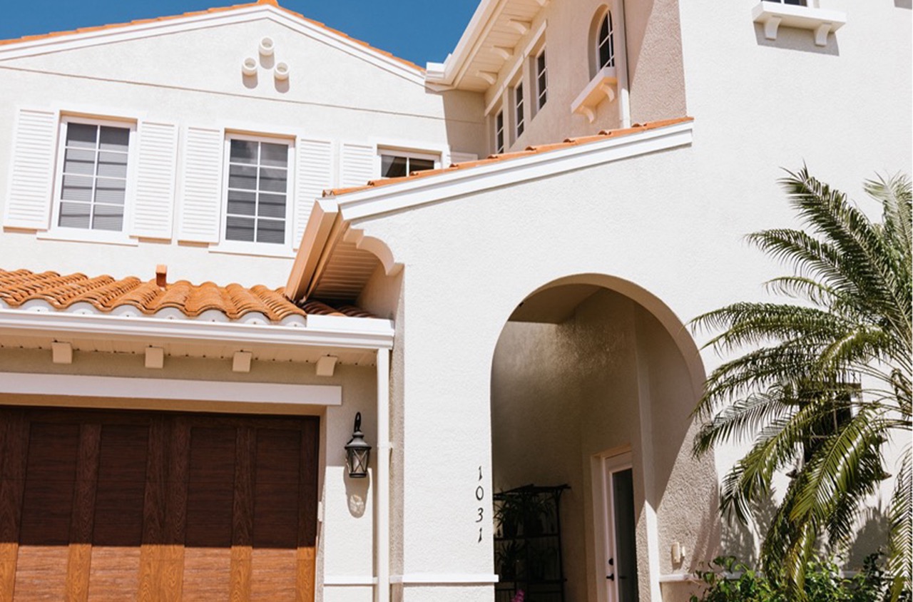
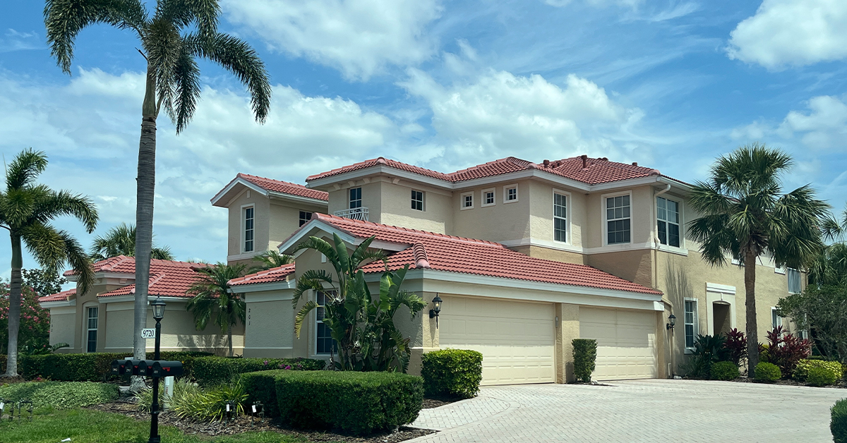
Choosing deep, rich colors for your space is an exciting opportunity to infuse personality and depth into your home or office. These colors offer a range of possibilities, from creating a cozy retreat to making a bold statement. But how do you determine which colors will work best in your environment?
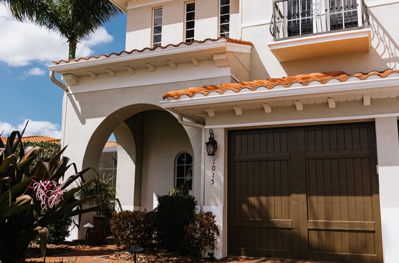
Understanding the nuances of darker shades can help you harness their power effectively. These colors can evoke feelings of warmth, elegance, and sophistication when used strategically. If you’re looking to add drama to a room or office, darker hues can delineate space and create focal points. However, applying them requires careful consideration of lighting, room size, and existing furnishings to maintain balance. For instance, a navy wall can elegantly offset a richly-patterned carpet or serve as a backdrop for art. But without sufficient natural or artificial light, these colors might overwhelm a small area.
Blending shades of deep hues can also enhance visual complexity, transforming a flat space into one that feels multi-dimensional. By considering the existing elements of your surroundings, you can select shades that complement your unique taste and enhance the aesthetics of your environment.
Selecting Deep Rich Colors
Choosing deep, rich colors for a space involves more than just picking your favorite hues. These colors bring warmth, sophistication, and a level of depth that simpler palettes might lack. Done right, they can transform a room, creating an ambiance of style and comfort.
Start with the purpose of the room. For areas meant for relaxation, like a living room or bedroom, opt for deep blues or greens. These colors are known to evoke calmness and can make spaces feel at once serene and enveloping. In high-energy spaces like kitchens or home offices, consider rich reds or terracottas for a stimulating influence, as they can boost creativity and vitality.
Consider lighting as a critical factor in choosing deep colors. Natural and artificial light can alter the perception of color. Rooms with plenty of natural light can handle darker shades, while spaces with limited light might benefit from slightly brighter versions of deep colors. Paint samples on different walls and observe how they look at various times of the day.
Scale and proportion should guide your choice of darker tones as well. In large, open rooms, deep colors can add intimacy and decrease a sense of openness. Conversely, in smaller rooms, these colors can either make a space feel snug or claustrophobic, depending on the lighting. To balance this, use lighter accents in furniture or decor to add contrast and break the monochrome feel.
The finish of your paint also impacts the appearance of the color. Matte finishes can soften the intensity of deep colors, creating a subtle and sophisticated look. Glossy finishes reflect more light, highlighting the room’s architectural features. Determine which finish aligns with the mood you want to set and the practical considerations of cleaning and maintenance.
Ultimately, selecting deep, rich colors involves looking beyond the surface and considering how color interacts with light, space, and the intended atmosphere of your room.
Purposeful Lighting Integration
Purposeful lighting integration significantly enhances both the aesthetic appeal and the functional efficiency of any space, whether it’s a cozy home environment or a dynamic commercial setting. Integrating lighting purposefully goes beyond just placing lights; it involves understanding how light interacts with colors and surface textures to create inviting and efficient spaces.
Start by assessing the color palette of your walls. Light hues reflect more light, making spaces feel larger and more open. In contrast, darker shades can absorb light, creating a warm and intimate atmosphere. For businesses, using a blend of lighter and darker tones can help define different areas and set suitable moods for various functions, such as customer reception versus administrative tasks.
Consider the direction and quality of light. Natural light enhances color accuracy and adds vibrancy. Maximize available daylight by positioning workspaces near windows or using strategic artificial lighting to mimic natural light. For residential areas, easy-to-manage dimmable LED lights afford adaptability, enabling transitions from bright task lighting to soft ambient hues as needed.
Ambient, task, and accent lighting should be strategically layered. In offices, ceiling lights can provide wide-reaching illumination, while desk lamps supply focused beams for tasks requiring concentration. Accent lighting highlights features or products, adding depth and drawing attention where desired. Within homes, combining a ceiling fixture with desk lamps or under-cabinet lighting in kitchens ensures functionality and style coexist.
The choice of fixtures impacts the overall design. Sleek, modern fixtures often complement minimalist or contemporary styles while ornate options might enhance traditional decors. Consider fixtures that serve dual purposes; for example, pendant lights can offer illumination and act as decorative elements.
Regularly evaluate that lighting setups meet current needs and adjust as necessary. A well-designed lighting plan not only enhances visual appeal but also contributes to productivity and comfort. By mindful integration of lighting designs, residential and commercial spaces can be transformed into vibrant and functional environments that cater specifically to their unique purposes.
Accessories and Furnishings to Match
Creating a harmonious space with accessories and furnishings is as much an art as it is a science. In commercial settings, external aesthetics can have a direct influence on a business’s brand identity, impacting customer impressions and employee morale. The convergence of colors, textures, and styles can help form a coherent visual narrative that is inviting and memorable.
Let’s explore some practical tips for matching accessories and furnishings effectively. Begin by identifying a color palette that aligns with the interior theme. Paint colors set the foundational tone, so choose accessories that complement these hues rather than compete with them. Familiarize yourself with the color wheel; analogous colors (next to each other) tend to harmonize well, while complementary colors (opposite on the wheel) create contrast.
Consider texture and material as you select accessories and furnishings. Mix different textures to add depth to a room. For example, pair a smooth, sleek table with plush, soft chairs. Materials should speak the same language; metallic finishes give a modern feel, while wood textures evoke warmth and tradition.
Proportion and scale play a critical role in design coherence. Ensure that no element overwhelms another, allowing each accessory to have its space. A large piece of artwork may dominate a wall, balanced by smaller accent pieces like vases or light fixtures. Consistency in scale fosters balance.
Use patterns judiciously. Stripes, florals, or geometric designs can infuse personality into a space, but overuse may lead to visual clutter. Keep patterns in moderation—think cushions on a neutral-colored couch or an accent rug that draws the eye without overwhelming.
Lighting is a crucial yet often underestimated component. The type and color temperature of lights can affect the perception of paint colors and fabrics, altering the ambiance significantly. Utilize both ambient and task lighting to create dynamic, layered illumination.
Strategically positioned mirrors can enhance light and make small spaces appear larger. Consider their placement to maximize natural light during the day and reflect well-lit, inviting spaces in the evening.
Lastly, embrace personal touches through art, plants, or collectibles that reflect the unique characteristics of the business. Genuine elements add warmth and authenticity, creating an environment that resonates with both clients and staff.
Next Steps
Balancing deep tones in low-light areas requires thoughtful planning, ensuring that your design feels both sophisticated and inviting. As you’ve navigated through the layers of color, lighting, and design elements, the fusion of deep tones with purposeful lighting and coordinated furnishings transforms a potentially dim space into an elegant sanctuary. Accentuating key features with strategic lighting not only enhances the color scheme but also enriches the overall atmosphere.
Attention to detail in accessories and furnishings can breathe life into the ambiance, ensuring that every element complements and elevates the mood you wish to create. Incorporate luxe textures and reflective surfaces to maintain vibrancy and prevent any oppressive feel that deep colors might evoke in low light. The right balance will seamlessly integrate comfort with style, fostering a naturally luxurious environment.
Should you need professional guidance to achieve this harmonious blend in your residential or commercial setting, A Step Above Painting offers expert consultation services. Reach out today for a free quote or consultation. Our team ensures that your space not only meets aesthetic goals but also becomes a testament to your unique vision.

