

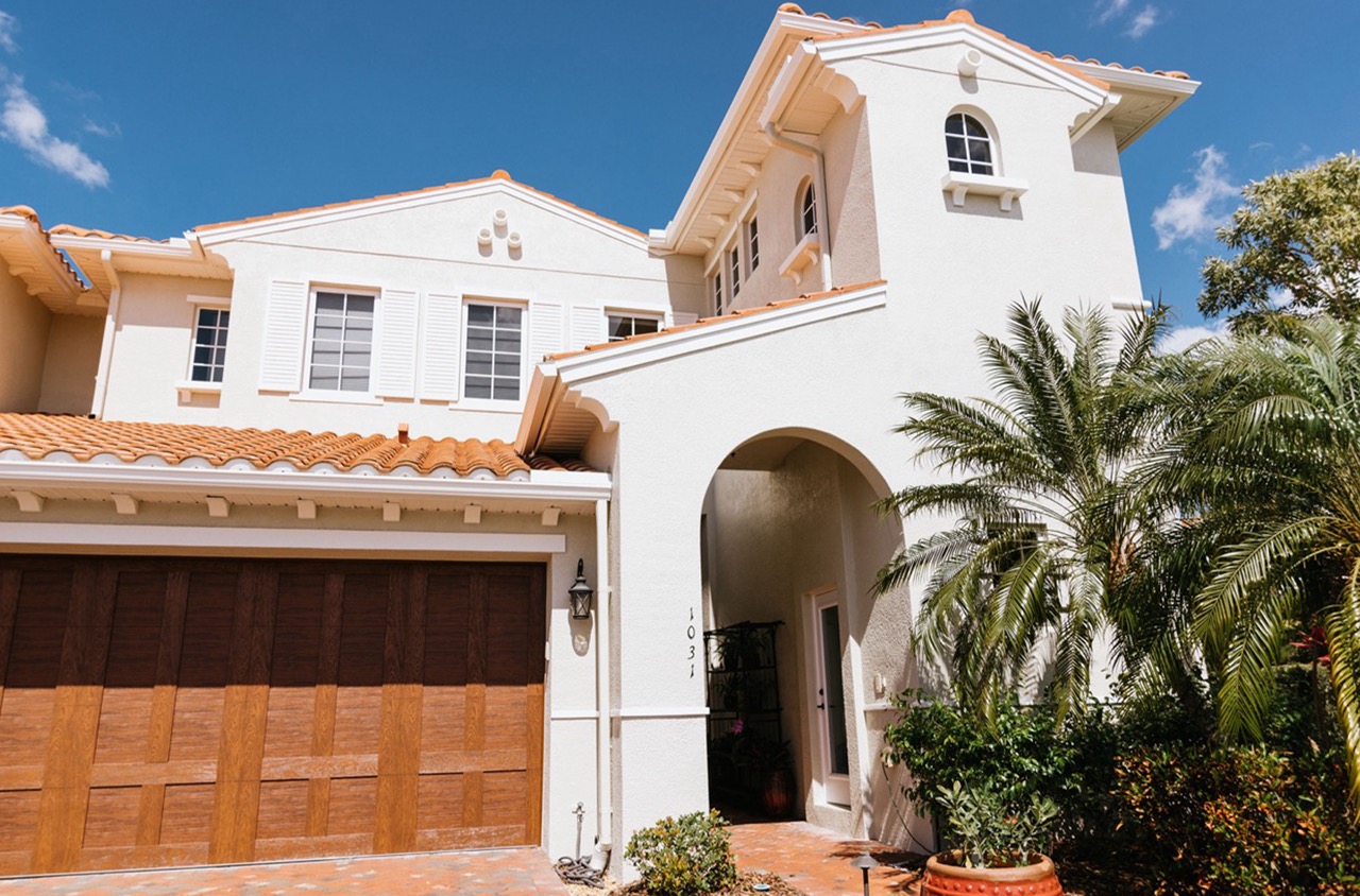
How can the transition between two adjacent rooms influence the overall aesthetic of your home? In interior painting, a smooth transition is more than a simple color match; it’s a subtle art that can transform spatial experiences. The way colors shift from room to room can affect mood, perceived space, and coherence in design. Consider the elegance of a carefully chosen color palette that naturally flows from the serene blue of a bedroom to the soft, muted green of a living area. This careful orchestration commands an unspoken harmony, enhancing both the beauty and functionality of a space.
Transition planning goes beyond surface appearance. It’s about creating visual continuity that guides the eye fluidly as you move through spaces. To achieve a seamless transition, consider factors such as lighting, architectural details, and the purpose of each room. Colors should complement not only the other rooms but also the light quality and time of day. With expert planning and execution, transitions between captured spaces can elevate your home’s interior from collections of individual rooms to a narrative of color and style.
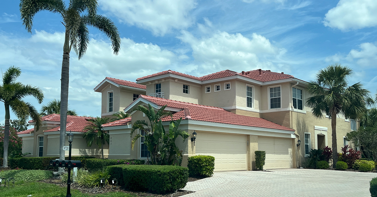
Smoother Transitions between Captured Spaces
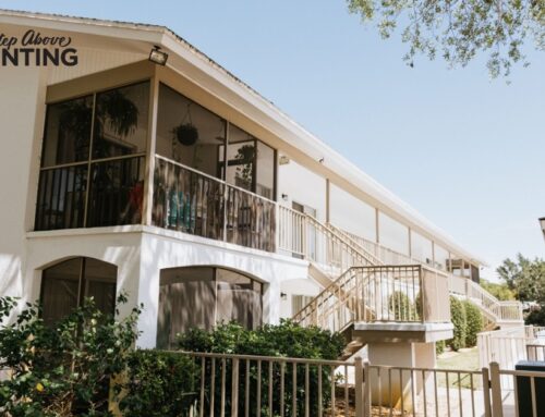
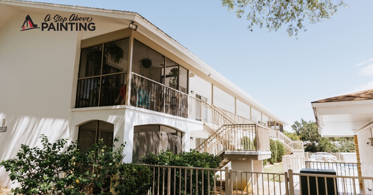
Effective color transitions can make or break commercial spaces. This is particularly important in environments like corporate offices, cafes, and medical centers, where the atmosphere influences clients’ and employees’ productivity and mood. To master smoother transitions between indoor areas, focus on a cohesive color scheme and subtle visual breaks
One practical approach is building a color palette that harmoniously flows across different spaces. Select three or four base colors, and extend these to include several shades or tints to allow for more nuanced transitions between rooms. For example, a coastal-inspired palette might use variations of teal, soft beige, and sandy yellow. This results in a fluid movement that subtly guides visitors through different areas without jarring changes in color.
Utilize transition spaces like hallways or doorways to bridge the gap between distinct areas. In these spaces, apply a lighter or muted version of colors that connect the rooms on either side. This technique acts as a visual cue, easing the eye from one space to the next. Additionally, consider texture transitions. Different finishes or materials can blend transitions from one area to another. For instance, a smooth matte finish in a quiet waiting area can beautifully contrast with the glossier textures used in a lively cafe section.
Lighting also plays a pivotal role in achieving seamless transitions. Natural light should be complemented by strategically placed artificial lighting. In areas lacking natural light, choosing paint colors that reflect or enhance available light can significantly alter the perception of space. Use softer, warmer tones to create inviting atmospheres in low-light areas, and employ cooler shades under intense artificial lighting to maintain balance and continuity.
Achieving smooth transitions requires more than just picking colors. Considering the texture, lighting, and the psychological impact of different colors should guide your choices. Even subtle contrasts in shades and finishes can strike a perfect balance between dynamic and soothing transitions, ultimately creating spaces that resonate well with visitors and occupants alike.
Transformative Techniques
Revitalizing a space involves more than just a coat of paint; it requires transformative techniques to ensure a lasting impression. For businesses aiming to make a statement through color and design, understanding these methods can be pivotal.
A major technique in transforming spaces is color psychology. Colors affect human emotions and behaviors, a fact any business can capitalize on. For instance, blue often conveys trust and calmness, making it suitable for financial institutions or healthcare facilities. Red can elicit excitement and energy, ideal for restaurants aiming to stimulate appetite and conversation. Understanding the emotional impact of color can guide your choices in creating environments that resonate with clients and employees.
Texture is another transformational element. A flat painted wall can become a focal point with the addition of texture. Techniques like rag rolling or stippling introduce dimension and interest. Businesses can use textured finishes to differentiate spaces, like applying a faux finish in a reception area to project elegance or ruggedness, depending on the desired impression.
Accent walls provide another avenue for transformation. By painting a single wall in a contrasting color or applying a bold pattern, businesses create visual interest without overwhelming the senses. An accent wall behind a reception desk or along a main hallway can become a storytelling canvas, subtly leading visitors through a narrative aligned with the company’s brand.
For an unexpected twist, don’t overlook ceilings. Painting the ceiling a different hue can change the room’s ambiance entirely. Dark colors can bring coziness to a large space, while lighter shades may enhance the feeling of openness.
Lastly, consider the mood lighting can create when paired with your chosen palette. Strategic lighting can highlight specific areas or art pieces, enhancing the room’s overall effect. It’s a straightforward yet effective technique for businesses to ensure their painted surfaces are given the attention they deserve.
Adopting transformative techniques thus allows businesses to leverage painting as a tool not just for aesthetic appeal but for strategic branding and experience crafting.
Balance and Proportion Considerations
Achieving harmony in your painting projects means understanding the concepts of balance and proportion. These principles can transform any space, crafting an environment that’s pleasing to the eye and well-suited for its purpose.
Balance, in terms of painting, is the equal distribution of visual weight in a space. You are not just decorating rooms; you’re creating experiences through color and texture. Symmetrical balance occurs when elements are evenly spaced around a central point, often used for more traditional settings. For a contemporary twist, consider asymmetrical balance. This might mean contrasting a deep, bold wall color with lighter-toned furniture or accessories. Asymmetry can add depth and interest to a room and can be particularly effective in commercial spaces where innovation and creativity are valued.
Proportion involves the relative size of elements within a space. It’s not about making everything the same size, but rather ensuring that the elements work well in relation to one another. A large room with dark walls needs larger artwork, and more substantial furniture to avoid looking unbalanced. Conversely, smaller spaces benefit from lighter colors and furnishings that don’t overwhelm the space.
Practical applications of balance and proportion focus on observation and simplicity. Begin with a color palette and evaluate the room’s features. Use one dominant color and complementary hues to provide subtle contrast. Consider the fixed elements like floors and countertops first since they offer a foundation for the rest of your design choices.
When selecting furniture and accessories, keep scale in mind. Oversized furniture in a smaller room disrupts proportion, while small pieces in a large room can feel lost. Balance can be achieved by gently varying textures and shades across the space. If you’re working with a bold paint color, softer textures or metallic accents can introduce equilibrium.
In commercial settings, such as office spaces, balance and proportion contribute to productivity and comfort. Neutral tones for walls combined with splashes of color in common areas can create an inviting atmosphere without overwhelming employees. Utilizing these principles thoughtfully can ensure your painting projects not only meet visual expectations but improve the overall use and appeal of the painted space.
Next Steps
In the hands of a skilled painter, color becomes a tool of transformation, softening hard edges and redefining room geometry. Selecting the right shades and expertly applying them can alter perceptions of a space’s dimensions. When light, color, and architecture align, the once rigid lines of a room can dissolve into a soft, encompassing flow. By painting adjacent walls in varying shades of the same color or using contrasting hues, what was once a stark boundary becomes a seamless interaction. This approach not only warms the atmosphere but also creates depth and layered interest in an otherwise flat room.
Blurring the lines with clever paint techniques makes rooms feel more expansive or intimate, adapting the environment to suit it’s intended function. Rooms with high ceilings can feel cozier with a darker ceiling color that draws the height down. Conversely, extending the wall color onto the ceiling can push boundaries upwards, offering a sense of airiness and open space.
A Step Above Painting knows that redefining your environment begins with understanding these subtle influences. Ready to transform your space? Contact us today for a free consultation or quote, and discover how paint can redefine not just your rooms, but your everyday living or working experiences.

