

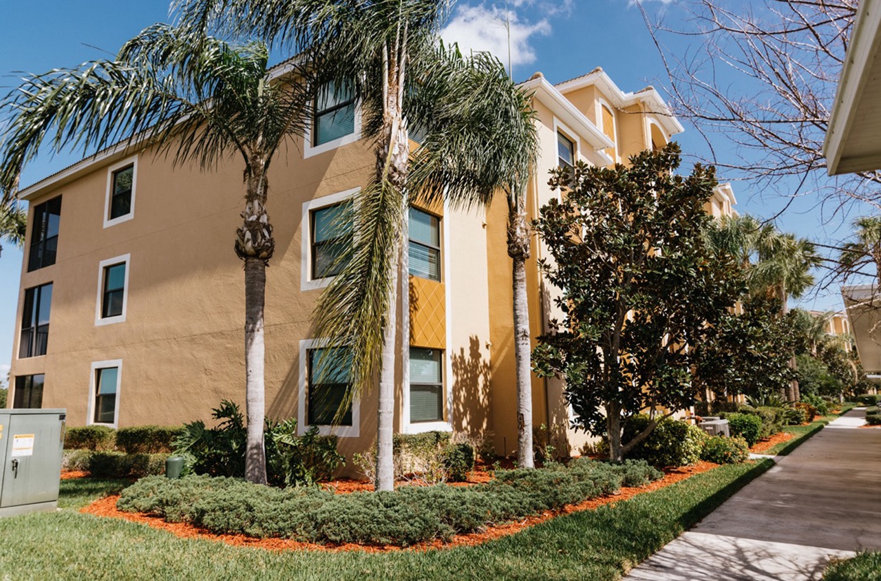
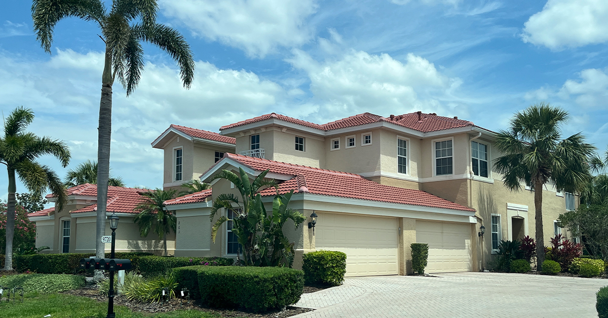
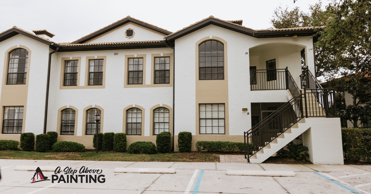
Color blocking isn’t just a fashion trend; it’s a powerful technique in interior and exterior painting that can transform any space. Have you ever considered how strategically placed colors can completely alter the mood of a room or enhance the architectural features of a building? At A Step Above Painting in Sarasota, we believe in the impactful art of color blocking to bring dynamic character and depth to both residential and commercial properties.
By using contrasting shades and bold demarcations, color blocking draws attention to specific elements, creating visual intrigue and balance. It involves more than simply applying contrasting colors; it requires an understanding of spatial dynamics and the psychological effects of hues. Imagine using vibrant tones to highlight an accent wall or utilizing subdued palettes to create a serene ambiance in a living space.
This technique allows homeowners and business owners to express individuality and style while also addressing practical needs like delineating spaces in open-plan areas. The principles of color blocking offer endless possibilities for creative expression, turning ordinary spaces into extraordinary environments. Whether it’s enhancing the curb appeal of a commercial building or breathing new life into a home, the strategic play of color blocks can make a distinct difference.
Principles of Color Blocking
Color blocking is a technique that involves pairing contrasting colors to create a bold, striking visual impact. In both residential and commercial settings, this approach can be transformative, enhancing the aesthetic appeal of a space while reinforcing brand identity. With practical understanding, businesses can use color blocking to invigorate interiors and leave lasting impressions.
First, understanding the color wheel is crucial for effective color blocking. This tool can help identify complementary, analogous, and triadic color schemes. Complementary colors sit opposite each other on the wheel, offering a high contrast that attracts attention. An example might be pairing blue with orange for a vibrant look. Analogous schemes use colors that are side by side, like green and yellow, providing a more harmonious feel. Triadic combinations involve choosing colors that are evenly spaced around the wheel, such as red, yellow, and blue, ensuring a balanced yet dynamic palette.
When applying color blocking, consider the proportion and scale of blocks. Larger spaces might benefit from larger blocks of color to avoid visual clutter. However, smaller areas might require more selective use of color to maintain openness. Creating zones through color can help direct movement and influence behavior. For instance, in an office, a combination of warm and cool blocks might evoke a mix of energy and focus.
Materials and finish can also impact the effectiveness of color blocking. Matte finishes tend to mute colors slightly, which can soften bold choices. Glossy finishes, on the other hand, make colors pop and can reflect more light, making a space feel larger. In commercial environments, considering durable, easy-to-clean paints can enhance both aesthetic and practical longevity.
For businesses, aligning color choices with company branding ensures consistency and brand recognition. Light pastel blocks might suit a spa, while deeper, more saturated hues might resonate with a tech firm. In retail settings, vivid color blocks can guide customer flow and highlight product displays, directly influencing customer experience and engagement. Embracing color blocking with a strategic approach can elevate a business’s interior design game while enhancing its overall brand personality.
Different Techniques for Every Room
Different painting techniques can significantly transform the look and feel of each room in a home or business, offering more than just a splash of color. By choosing the right technique, you can create the desired ambiance, accentuate architectural features, and reflect your personal style.
For living rooms, consider using a sponge painting technique. This method involves adding texture to the walls by dabbing a sponge with paint. It works well in creating a warm and inviting atmosphere. A monochromatic color scheme is recommended, using shades that complement the room’s furniture and decor.
In kitchens, a crisp, clean look is often preferred. The wash technique, or color washing, can achieve this. Start with a base coat and apply a lighter color with a brush in swift, criss-cross strokes. This creates a soft, timeless finish that works well in spaces with abundant natural light. When selecting colors, consider hues that enhance appetite—such as soft yellows, greens, or even muted reds.
Bathrooms benefit from stenciling, offering a way to introduce patterns without overwhelming a small space. For this, choose waterproof paints and durable stencils that can withstand the moisture often present in bathrooms. Geometric patterns or botanical designs are popular choices as they offer a spa-like feel.
Bedrooms are often sanctuaries where people seek relaxation. The rag rolling technique can lend a sophisticated yet soothing texture. This process entails rolling a slightly damp rag over wet glaze on the wall, creating a distinctive finish. Opt for hues that promote tranquility, like light blues or neutral shades, to encourage restful sleep.
In commercial spaces, the ombre technique creates a modern and dynamic effect. This gradual blending of one color hue to another can be playful or professional depending on the chosen colors and gradients. It’s especially effective in creative environments like cafes or collaborative workspaces, suggesting innovation and movement.
Choosing the right painting techniques carefully tailored for different rooms enhances not only aesthetics but supports the function and mood of each space.
Impact of Color Blocking on Room Dynamics
Color blocking can profoundly transform room dynamics. It involves using contrasting colors in distinct blocks or sections to create visual impact and define spaces. Applying this to a business environment can enhance productivity and client experience.
First, understanding color psychology helps in choosing the right palette. Certain colors evoke specific feelings—blue is calming; red energizes; green promotes balance. Align these colors with the room’s intended function. For instance, invigorating hues can stimulate creativity in a brainstorming space, while calming shades may benefit meeting areas.
Plan which areas to highlight. Color blocking isn’t random; it requires strategic placement. Consider accent walls or columns that draw attention to key structural aspects or create focal points. In an office lobby, using vibrant colors behind reception can direct focus efficiently, introducing visitors to your business’s vibrant culture.
Think beyond walls. Furniture and decor offer additional opportunities to incorporate color blocks, creating cohesion. A bold-colored couch set against a neutral backdrop adds depth without overwhelming the room. Similarly, contrasting shelving or fixtures can delineate spaces efficiently. In retail settings, strategically placed color blocks can direct customers’ paths, subtly guiding them towards featured products.
Incorporate texture with color blocking for added depth. Matte surfaces absorb light for a more subdued effect, while gloss or metallic finishes reflect, adding energy. In hospitality settings, integrating textures through colored tiles or patterned upholstery can enhance the atmosphere, enticing guests to linger.
Balance is crucial. Avoid overcrowding a room with too many vibrant colors, leading to visual fatigue. Instead, focus on harmonizing bold color blocks with neutral areas to maintain flow. In commercial spaces, this balance aids in distinguishing between active work zones and relaxed break areas.
Ultimately, color blocking isn’t merely about aesthetics; it’s a tool to mold room dynamics deliberately, enhancing functionality and atmosphere within a business environment.
Next Steps
Incorporating color blocking into contemporary interior design offers boundless possibilities for innovation and personal expression. This technique not only revitalizes spaces but also creates unique atmospheres suited to individual styles and purposes. Whether you are looking to energize a commercial environment or transform a residential space into a welcoming haven, strategic use of color blocking can align aesthetics with functionality to command attention and cater to practical needs.
As spaces evolve, embracing bold colors can stimulate conversation and creativity, enhancing both individual experiences and collective interactions. Whether you’re highlighting architectural features, delineating spaces, or crafting an immersive brand experience, the thoughtful application of color blocking can significantly uplift both the visual appeal and practicality of any environment.
As you consider adopting color blocking in your next project, A Step Above Painting offers the expertise to bring your vision to life. Our understanding of hues, texture, and design principles ensures a tasteful and effective transformation. Contact us for a free consultation or quote and delve into the vibrant potential of color. Discover how a splash of ingenuity with expertly applied blocks can redefine your spaces into dynamic expressions of elegance and style.


